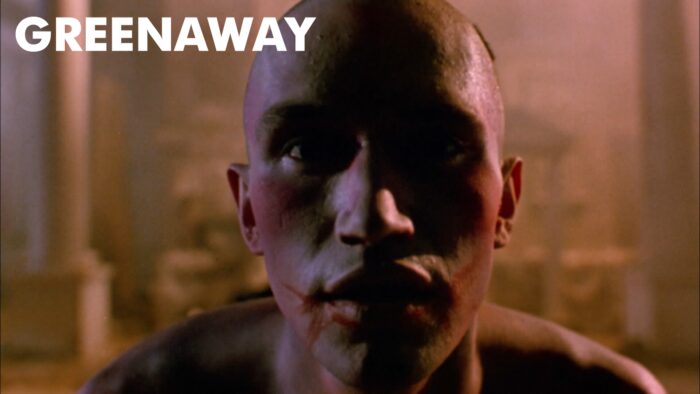
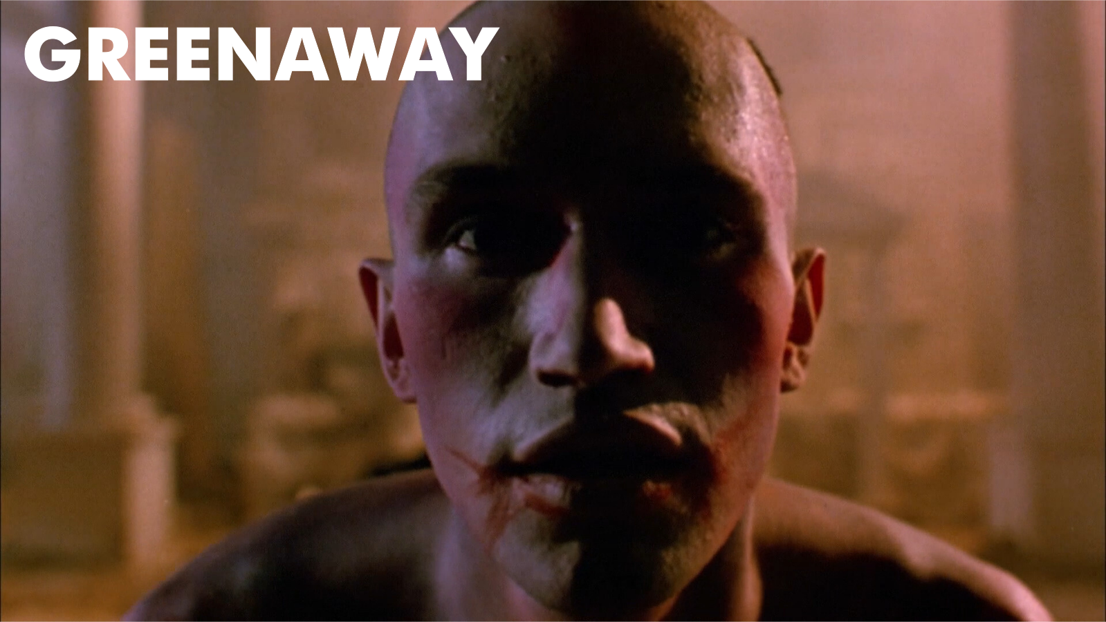
This is in 16:9, so I assumed that it had been cut down, but this was apparently filmed in this aspect ratio? Very unusual for its time, but Greenaway has always been in the avant garde…
Yes, I’m continuing my “80s Arthouse Movie” series, even thought this is from 1991. I think I’ve got like three movies to go, and then I’m done.
I didn’t see this at the Cinematheque at the time — and I didn’t think I’d seen it at all, but I have — it was shown on Swedish television a couple years later.
OK, I usually write these blogs while watching the movie (whenever I take a terlet break or get bored), but I was so fascinated by this one that I didn’t type a single word while it was running. So I’m writing this blog post afterwards, so perhaps I don’t remember what I was going to write…
First of all, I could only find this bluray in an edition from Spain, which I thought was really weird.
But… this isn’t really a restored edition like I was expecting: The previous Greenaway movies I’ve seen this year have been exquisitely restored by the BFI, and this has not. But there may be a reason for that:
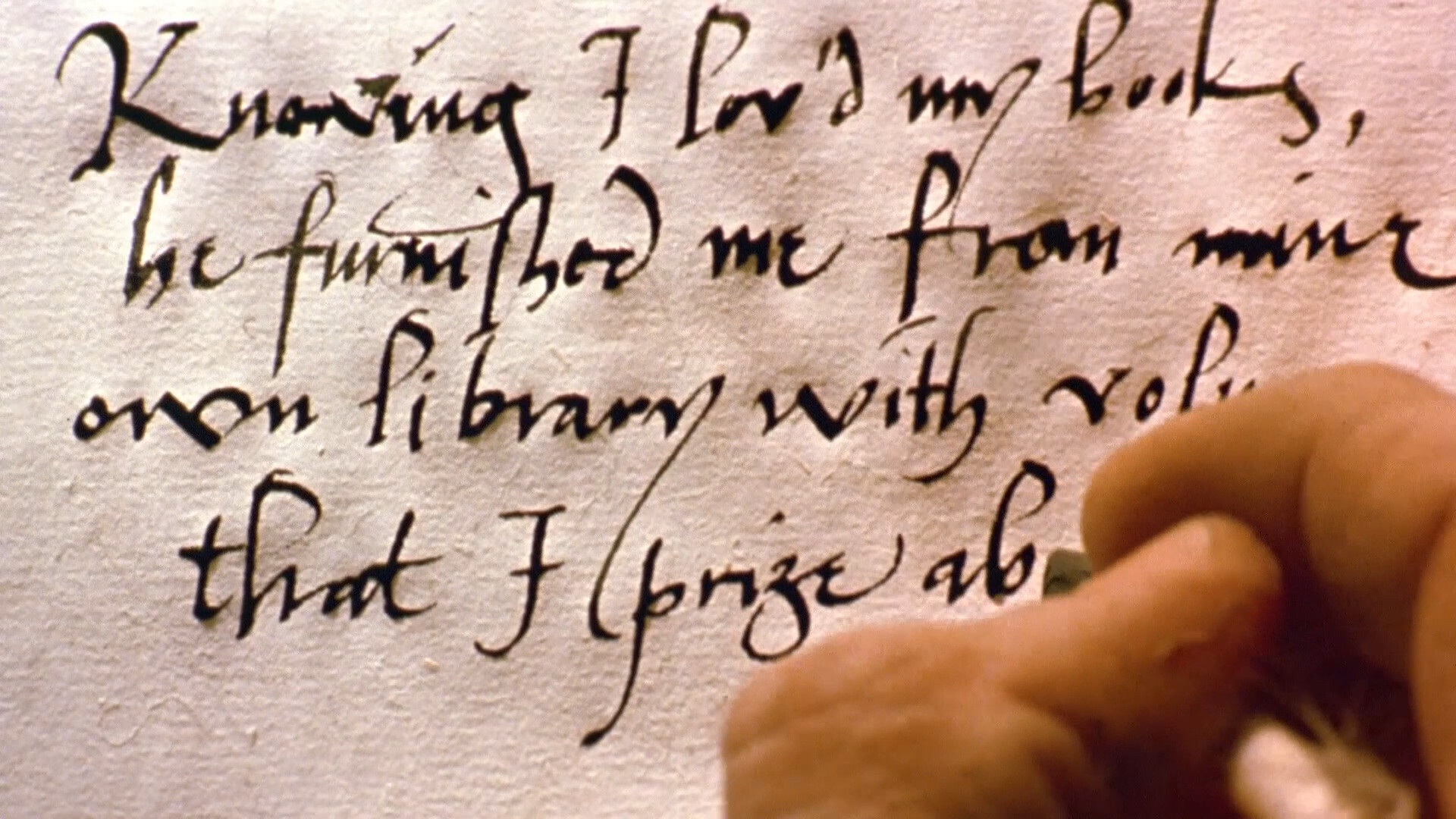
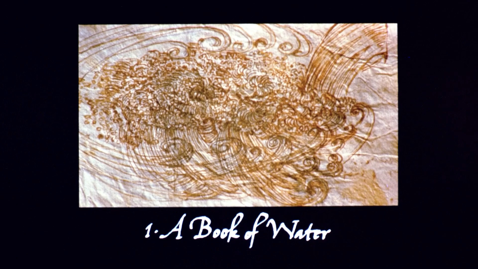
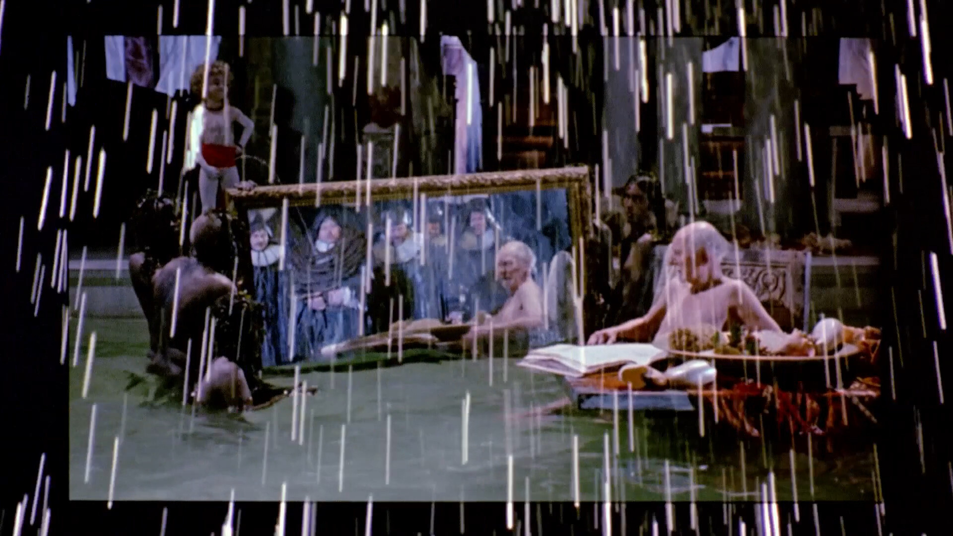
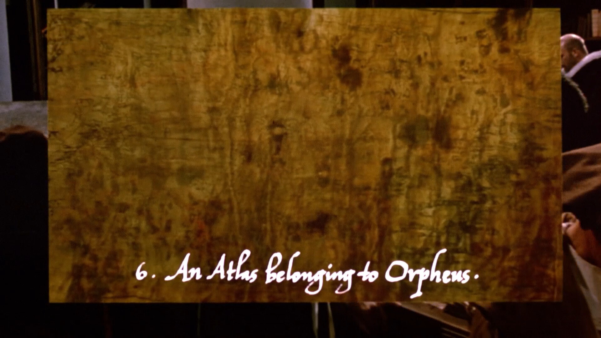
Edited in Japan, it makes extensive use of digital image manipulation (using Hi-Vision video inserts and the Quantel Paintbox system), often overlaying multiple moving and still pictures with animations.
If I understand correctly (and I’m guessing at some bits here), this means that this movie was filmed on 35mm film, but then edited together on hi-def video using Quantel Paintbox for bits. And then transferred back to 35mm for showing in theatres. And that is probably what has been scanned here in 2K for this bluray?
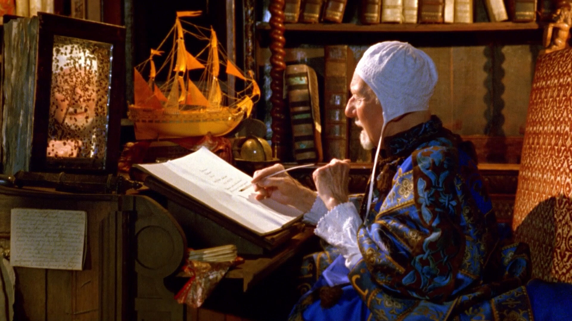
So it looks like that: It looks like hi-def analogue video. Which isn’t a bad thing! But Greenaway’s sets are so baroque and detailed, and all that detail is lost.
Wim Wender’s Wings of Desire had a similar problem: He used so many dissolves and overlays that what was shown originally in theatres was a seventh generation copy (at best). So when they restored it a few years back, the went back to the original negatives, scanned them, and then painstakingly recreated every edit, overlay and dissolve to mimic the original. And it looks amazing, but was very expensive, of course.
And doing that to this movie would be even more work, because there’s so many edits, inlays and overlays all the fucking time. And this isn’t even a movie that people like! It got exactly zero (0) votes in the 2022 Sight & Sound poll.
(Of course, part of the reason for that might be that it’s not available to watch anywhere…)
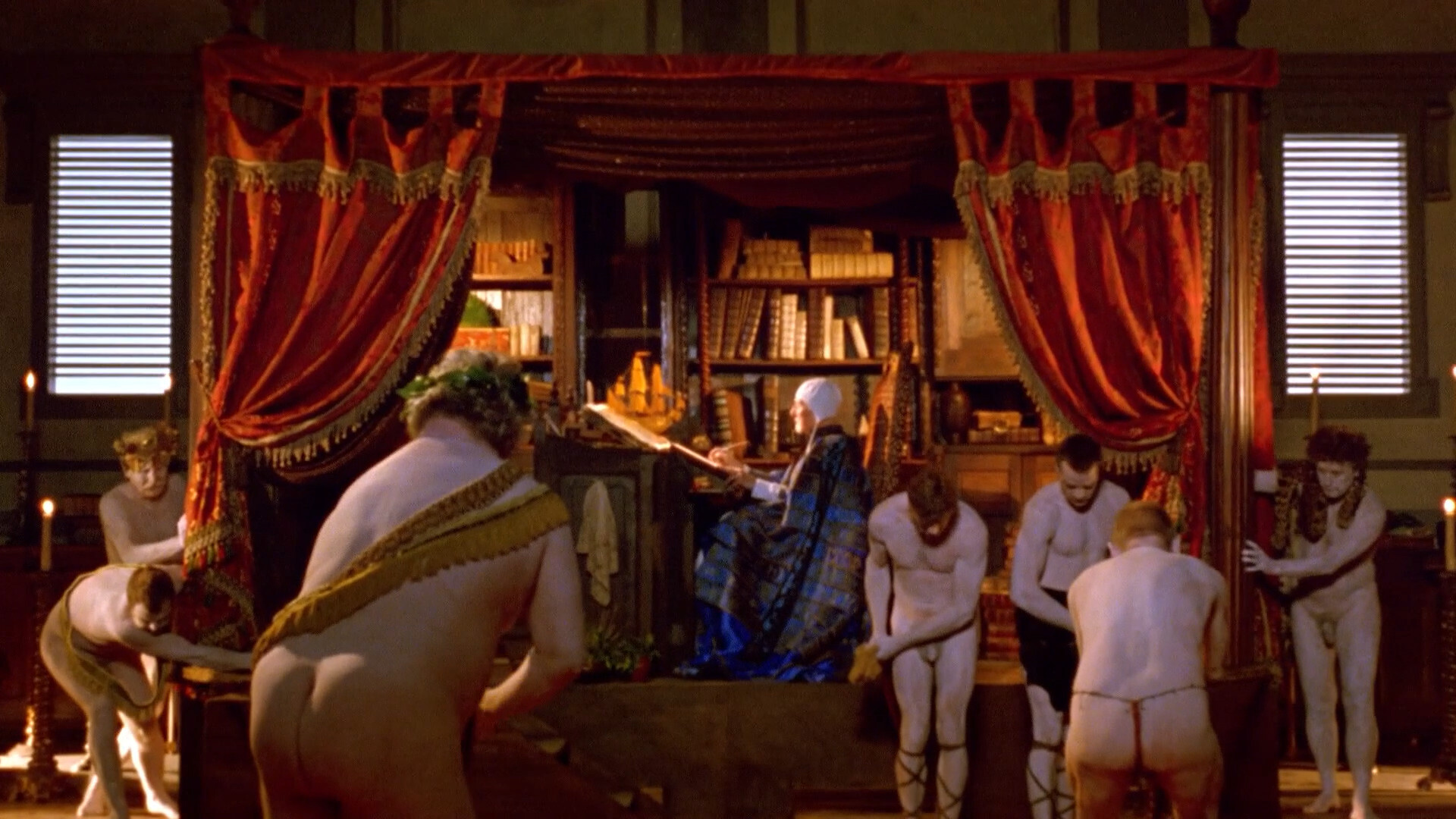
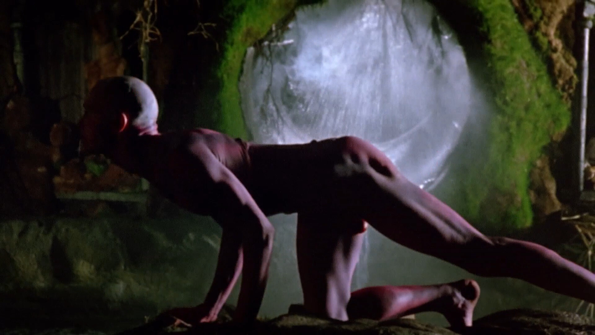
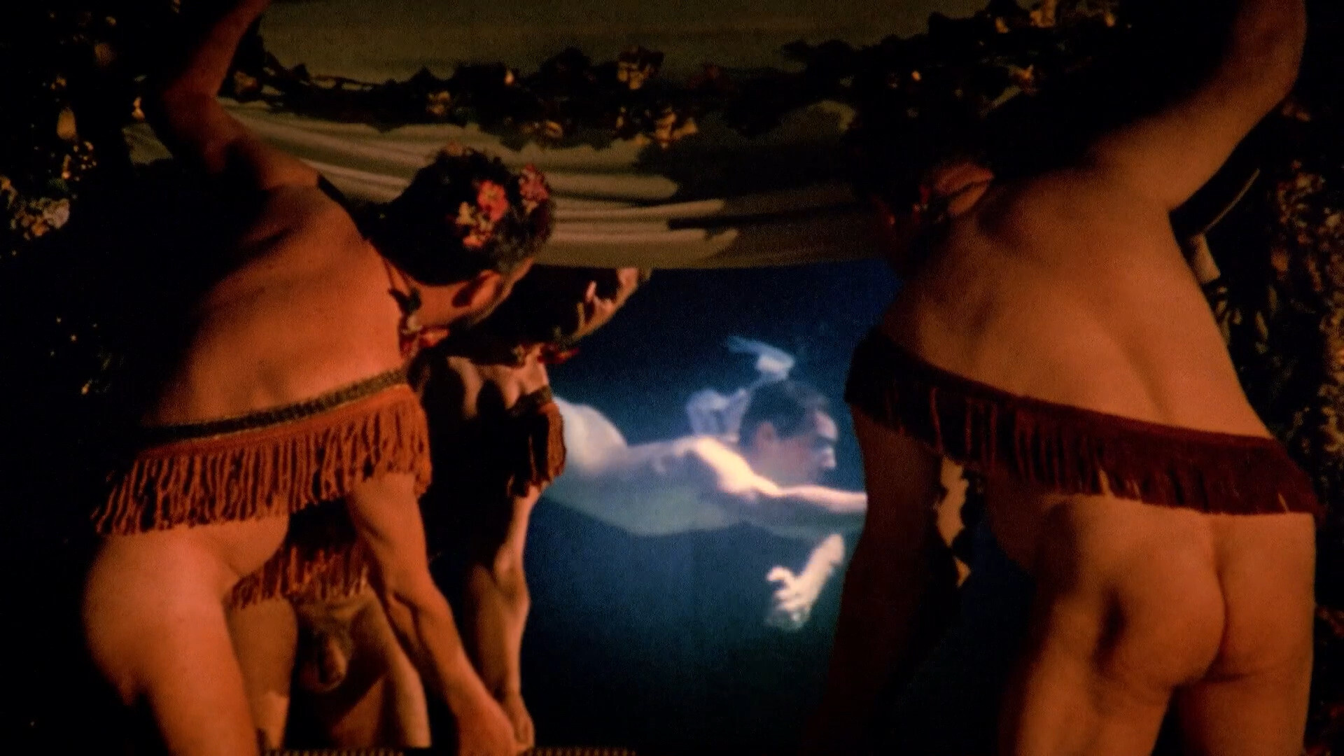
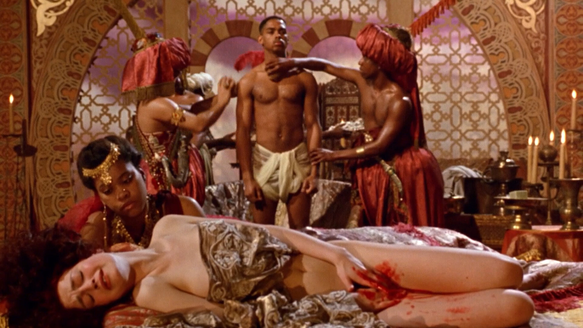
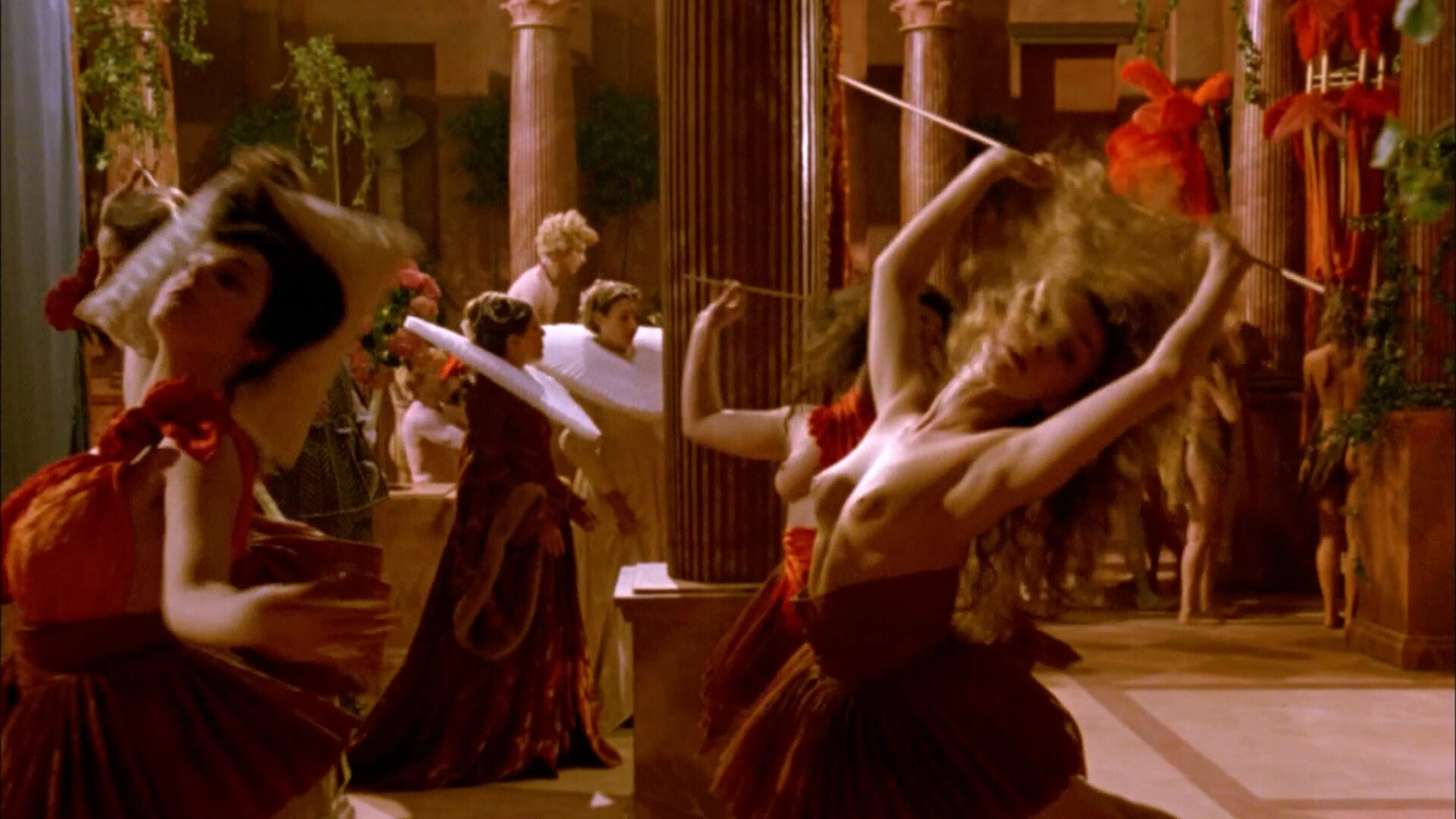
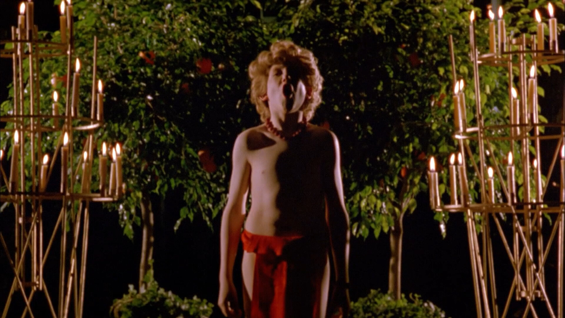
Er, yes, did I mention there’s some nudity in this movie? There’s nudity in this movie — basically in every other scene. But there’s nothing sexual, really.
Heh, it needed a lot of financing…
WTF?!? It had a 1.5M pound budget!? That’s insane! There’s so many scenes, each with an elaborate, baroque setup, and each scene lasts like seven seconds, and then it’s on to the next one. How on Earth did Greenaway do that with that small a budget?

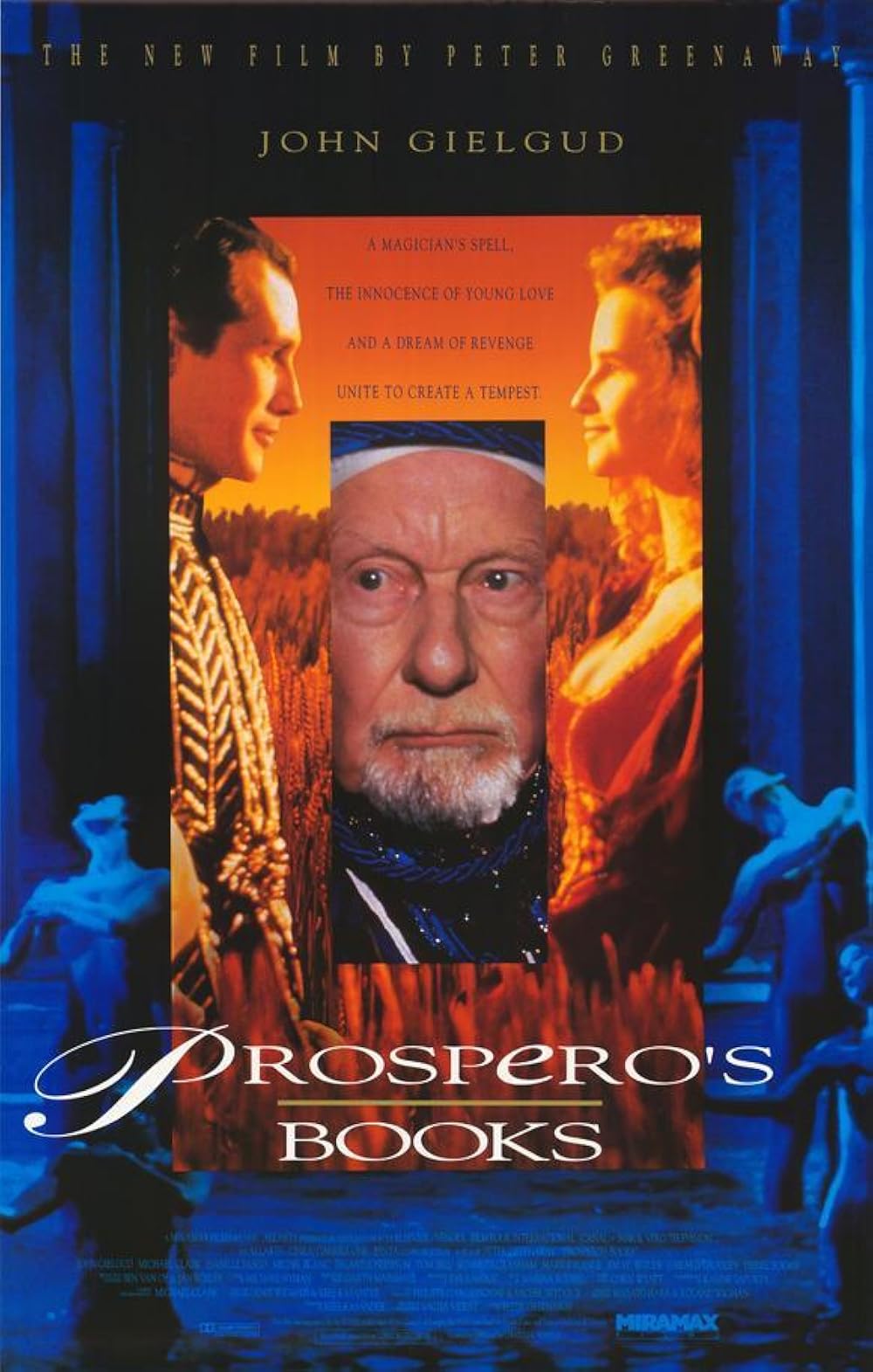
Yes, that Gielgud. Because:
Gielgud is quoted as saying that a film of The Tempest (with him as Prospero) was his life’s ambition, as he had been in four stage productions in 1931, 1940, 1957, and 1974. He had approached Alain Resnais, Ingmar Bergman, Akira Kurosawa, and Orson Welles about directing him in it, with Benjamin Britten to compose its score, and Albert Finney as Caliban, before Greenaway agreed.
[…]
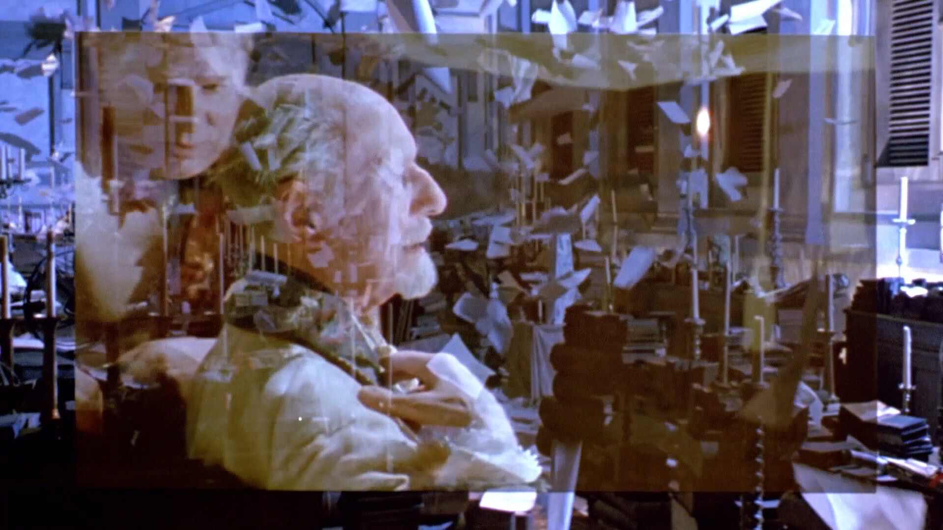
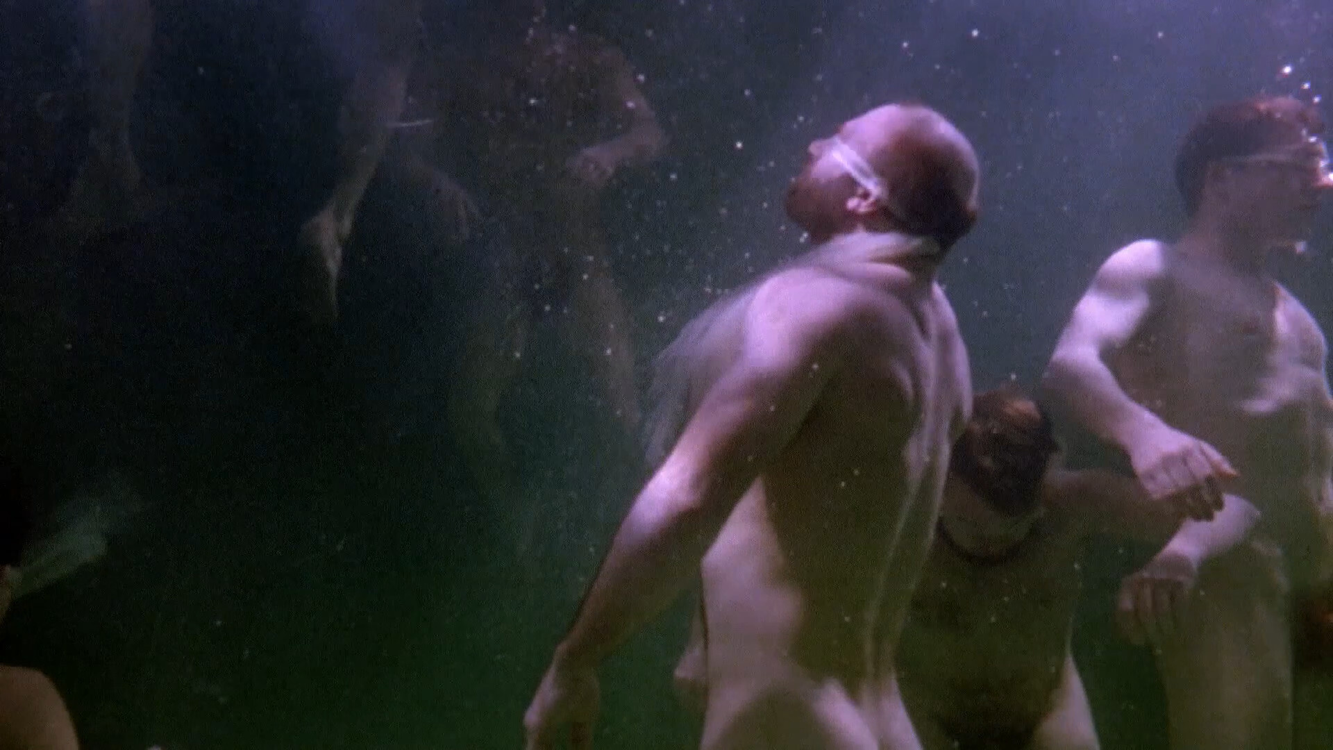
“I was glad I knew the part so well, because there was so much going on in the studio to distract me,” Sir John recalled, “I had to parade up and down wearing that cloak which needed four people to lift, and with papers flying in my face all the time. And it was terribly cold in the bath.” Sir John spent four frigid days during the winter naked in a swimming pool, to choreograph the shipwreck with which the film begins.
Heh heh.
Speaking of The Tempest, I re-watched the Derek Jarman version earlier this year, and… they’re very different movies. Jarman famously disliked Greenaway a lot, but I wonder whether he saw this before he died… It’s a lot closer to Jarman’s aesthetic than any of Greenaway’s previous movies.
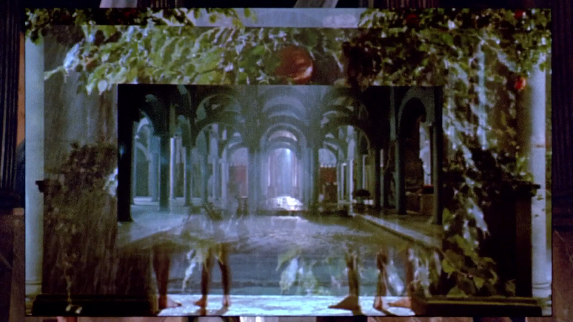
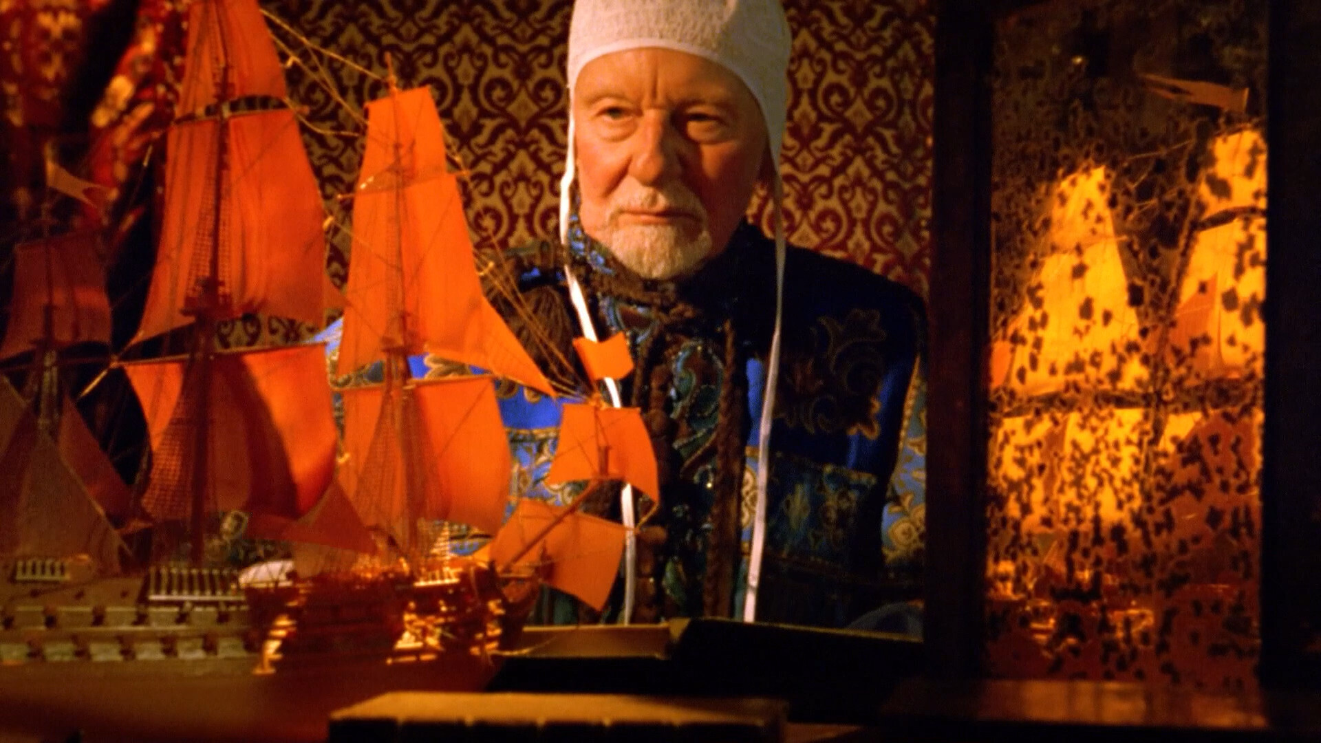
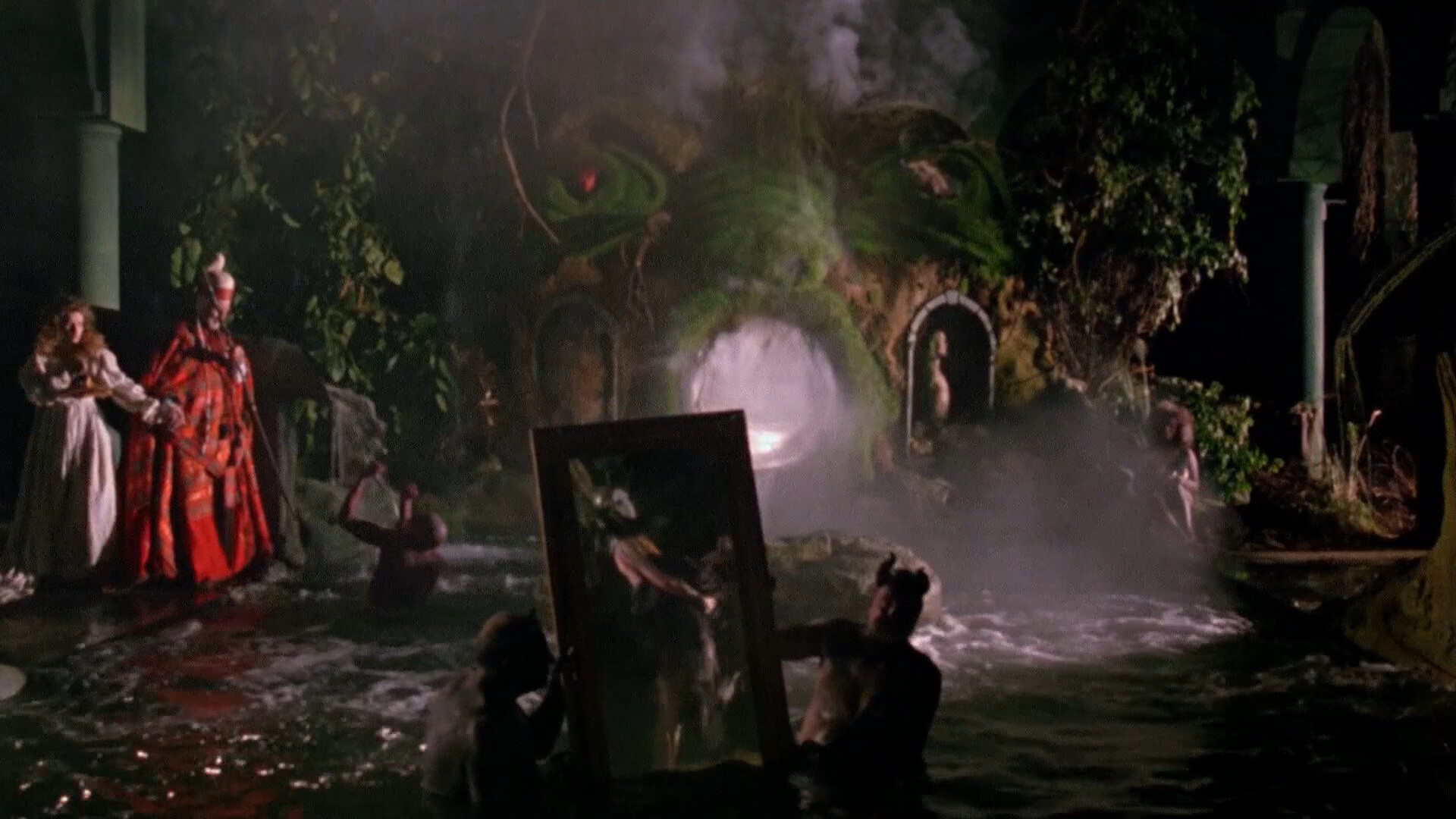
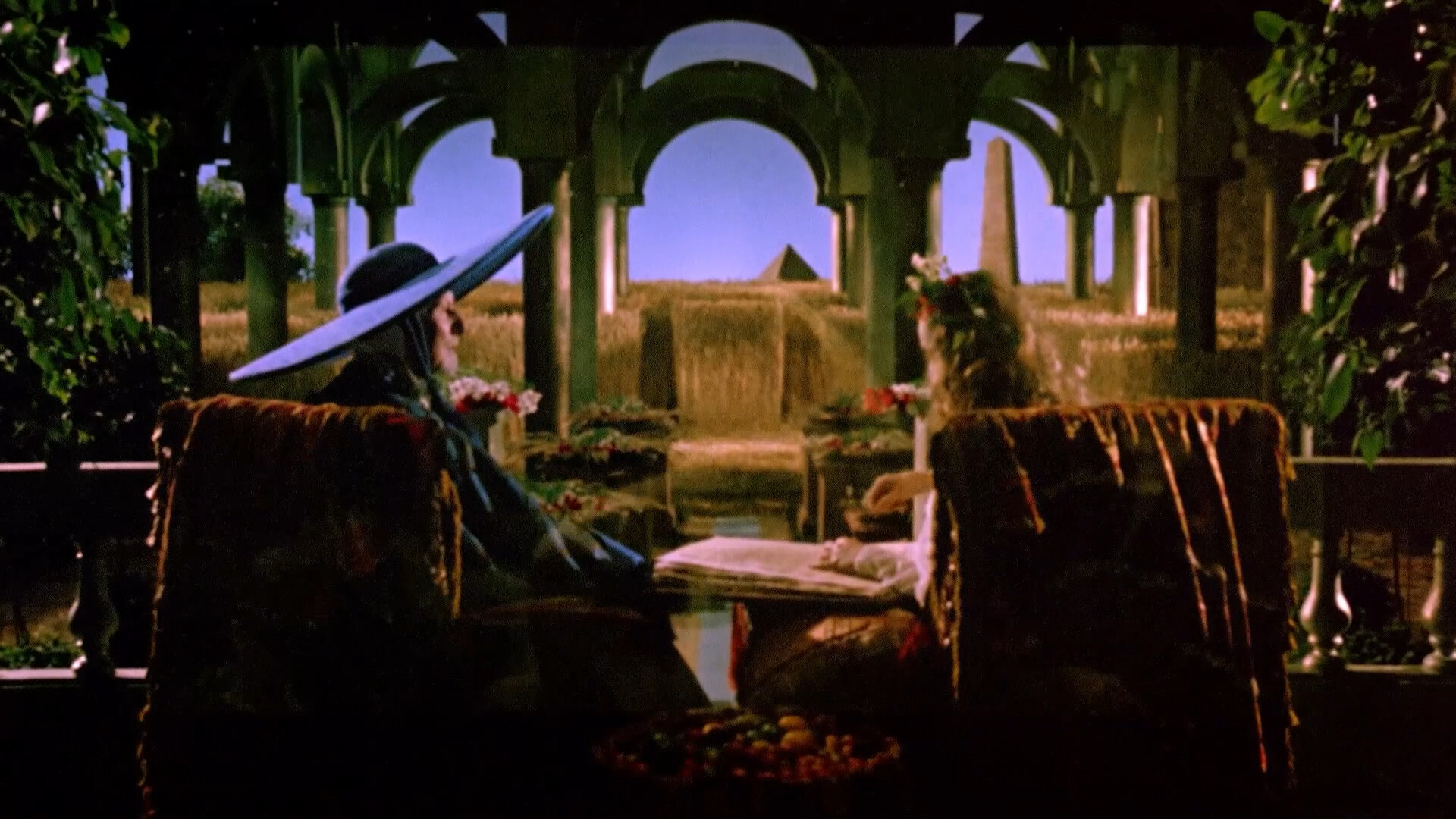
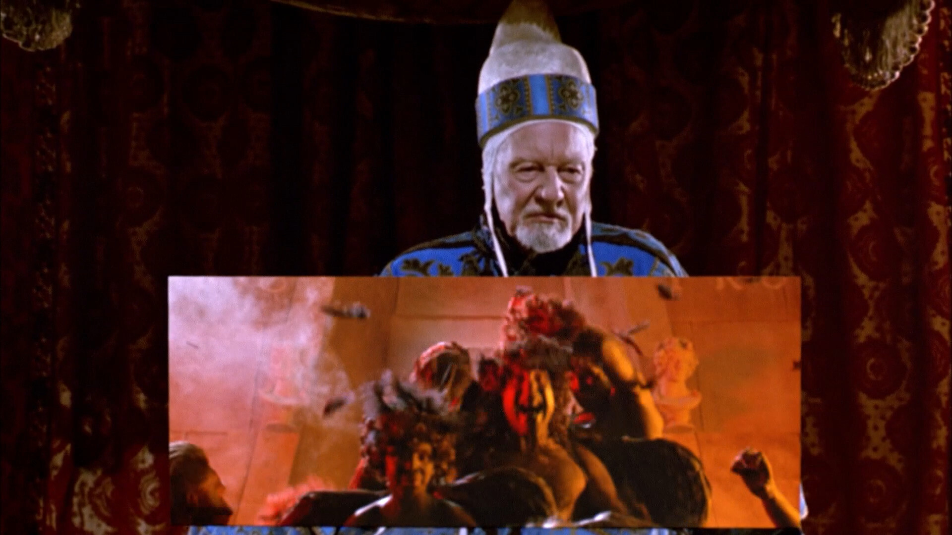
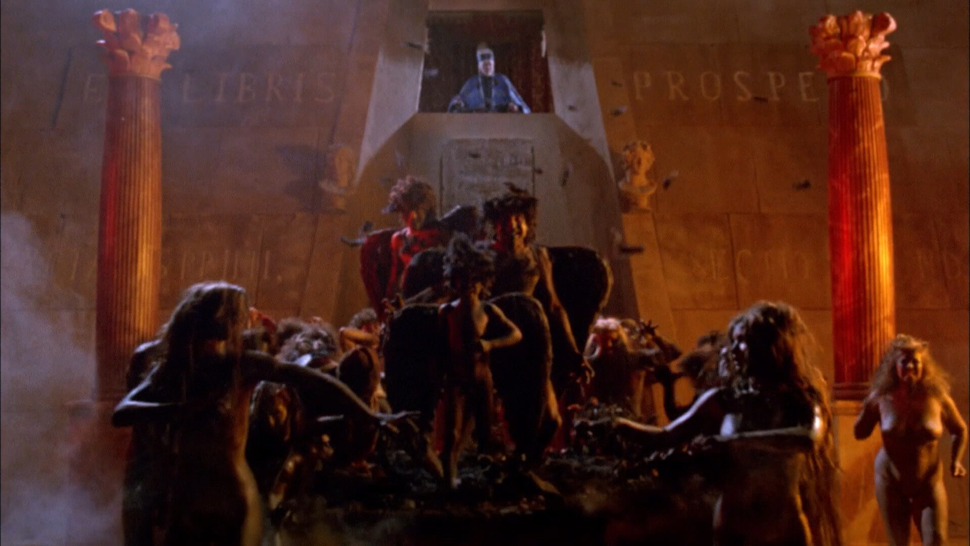
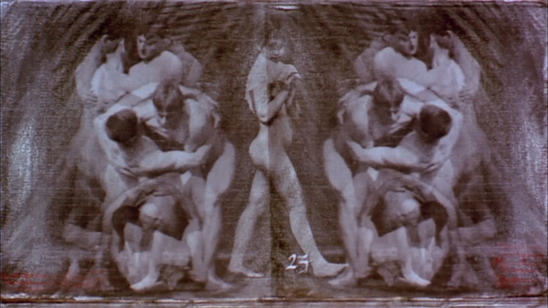
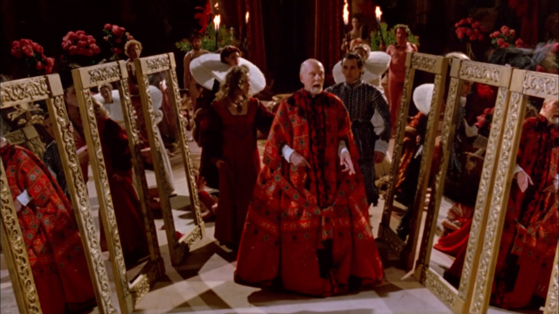
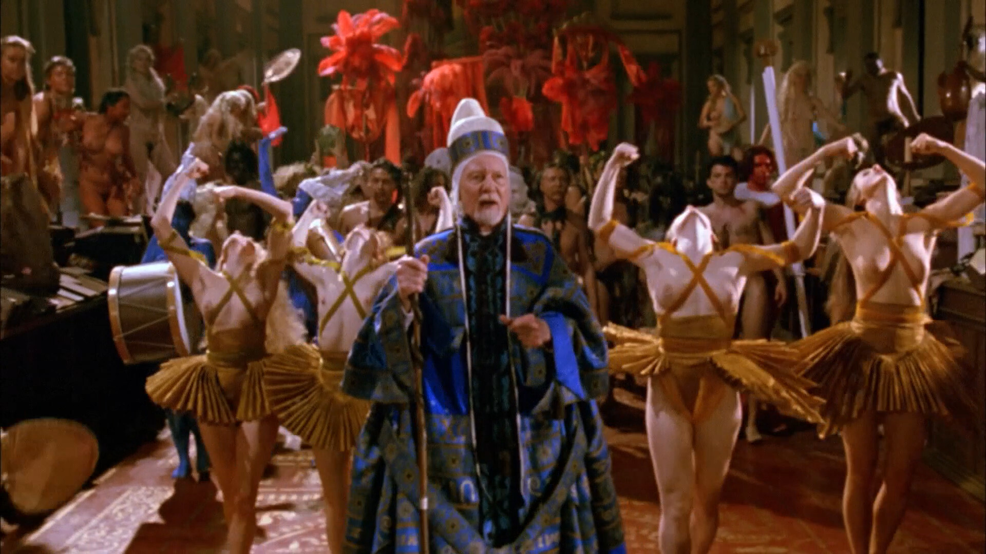
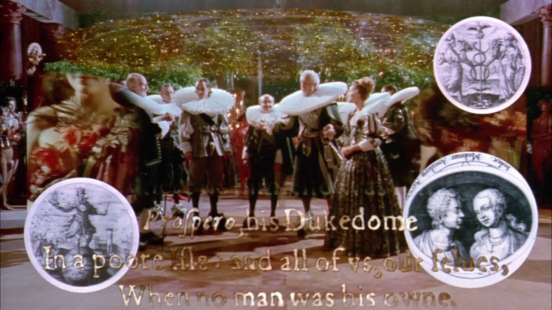
These two shots are typical — there’s all these frames within frames, and images overlaying images, and it’s all sensory overload. And it looks great! Within the confines of hi-def analogue video.
Heh heh.
I’m guessing the titles are from Quantel Paintbox?
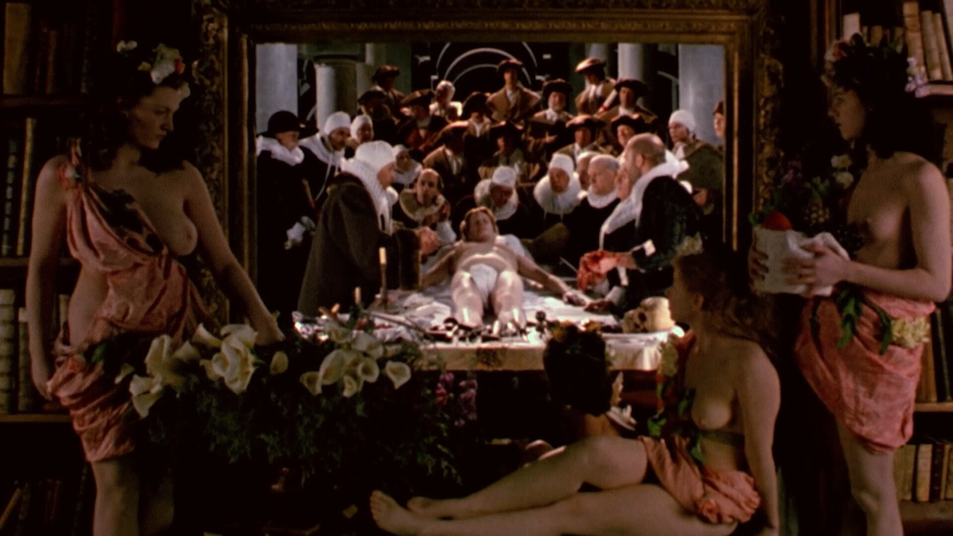
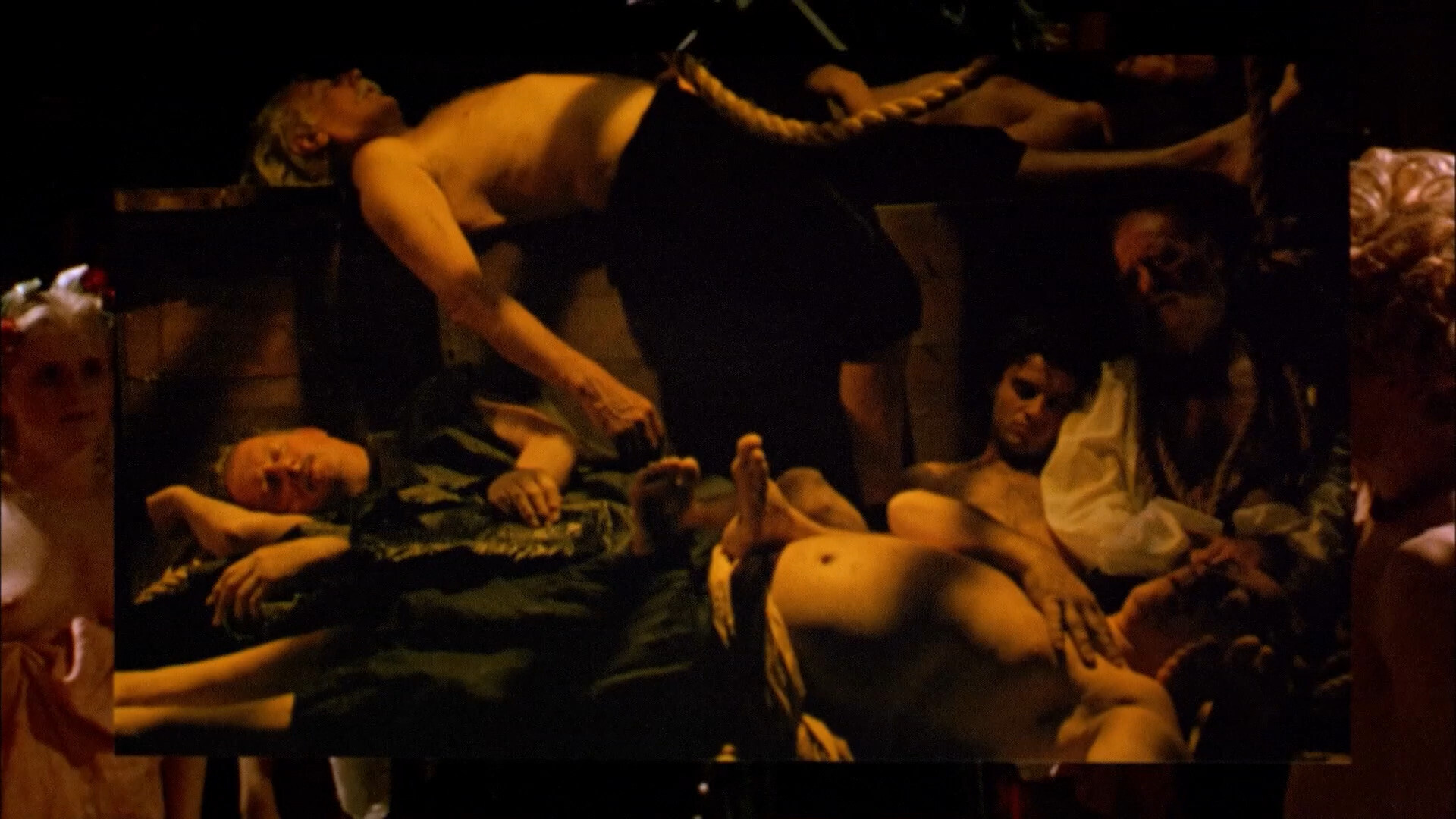
There’s also a lot of these shots — where we see previous scenes within these frames, viewed by other characters. It’s great!
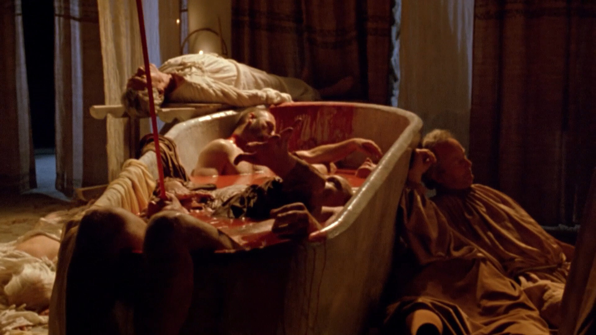
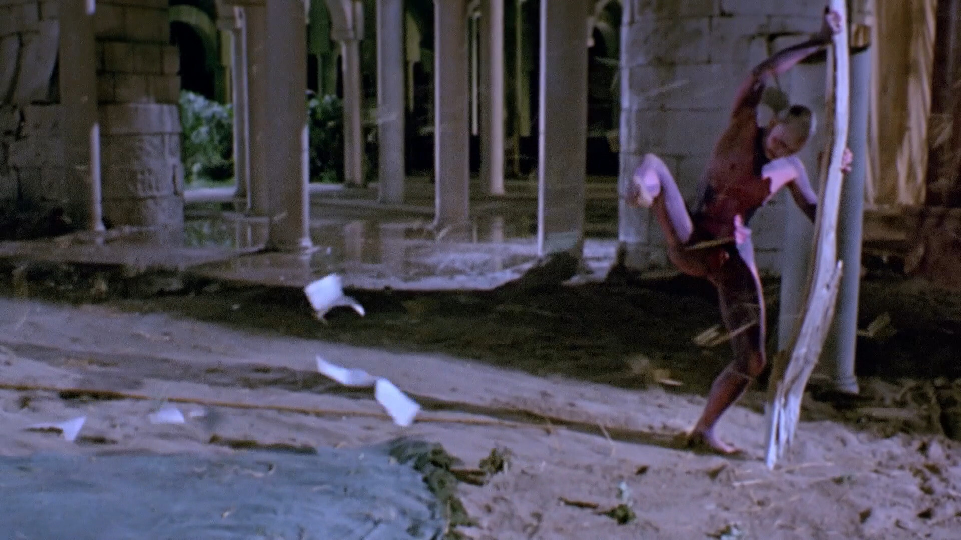
It’s also quite violent.
Aww.
But, err… Another reason people might not be jumping at the opportunity to do a re-release of this is that there’s is (among all the other nudity) a significant amount of child nudity, and that can quickly go like EEEK. So I’m not including any shots of that here at all because I’ve noticed that whenever I include a shot that even vaguely points towards that, I get a gazillion hits from Russian search engines, for some reason.
And nobody wants that.
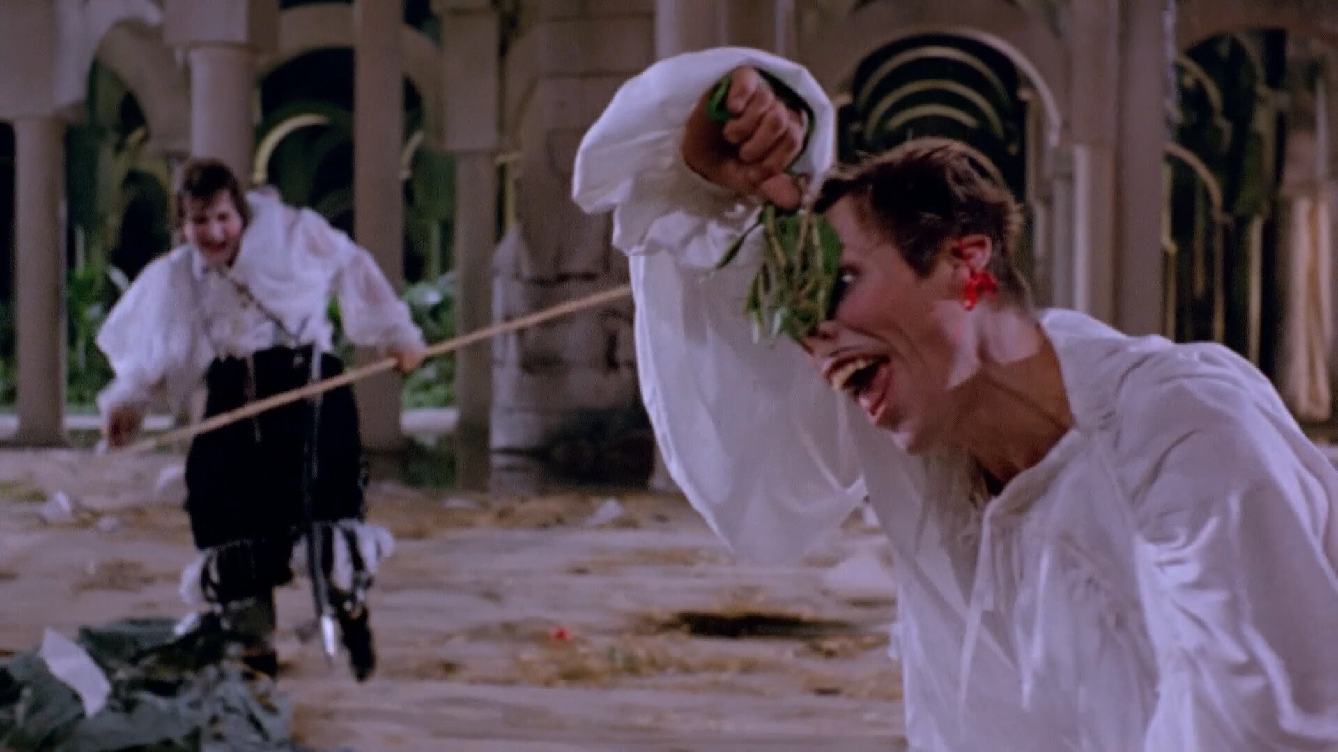
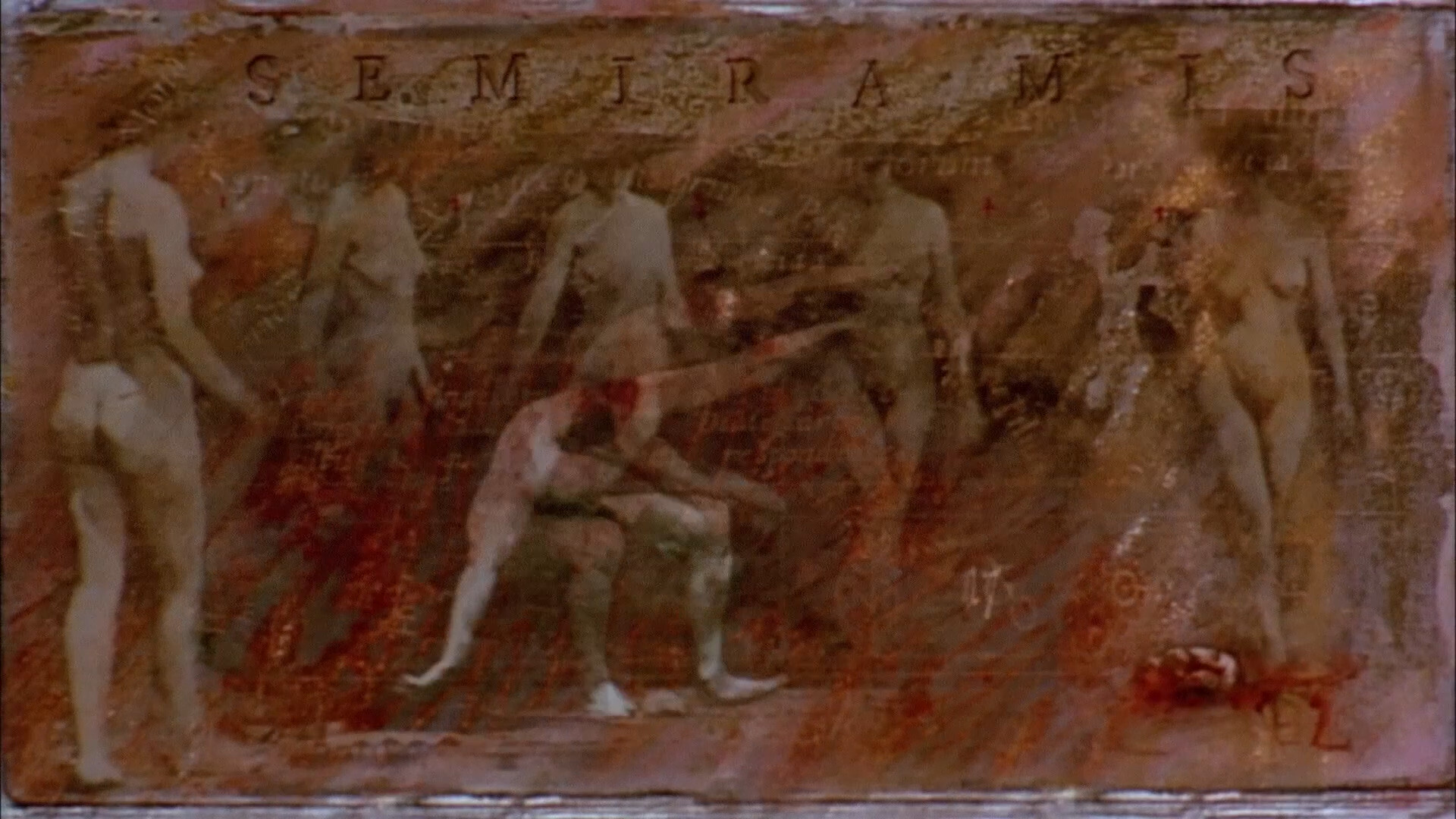
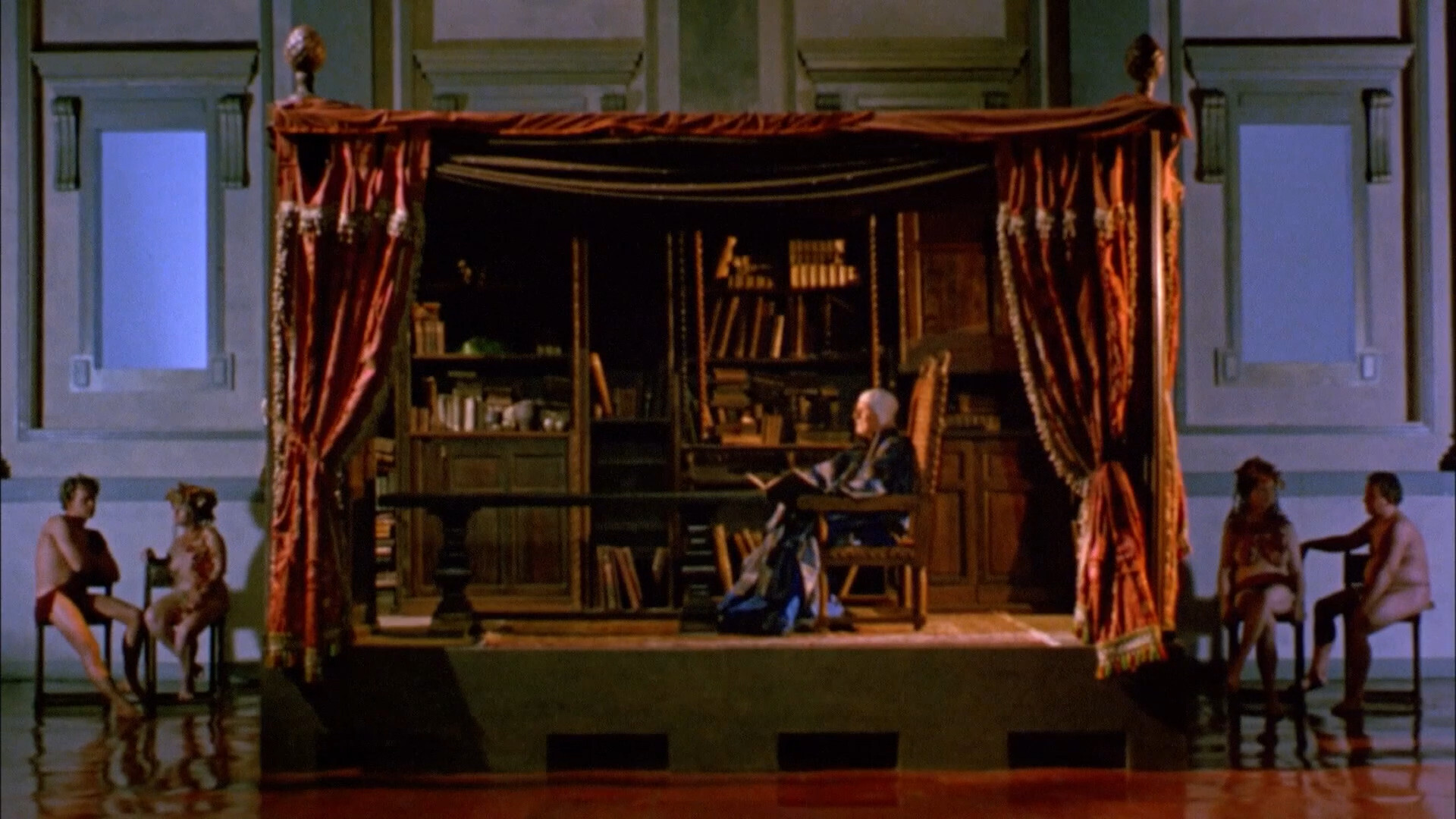
These shots are just so elaborate… just… how…
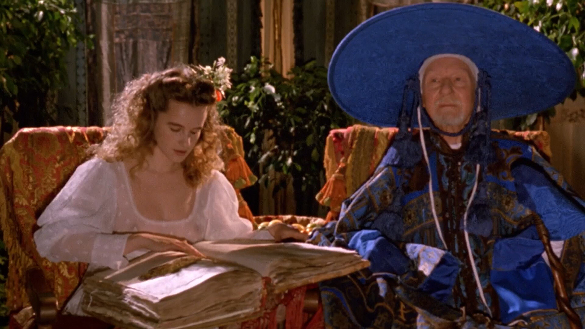
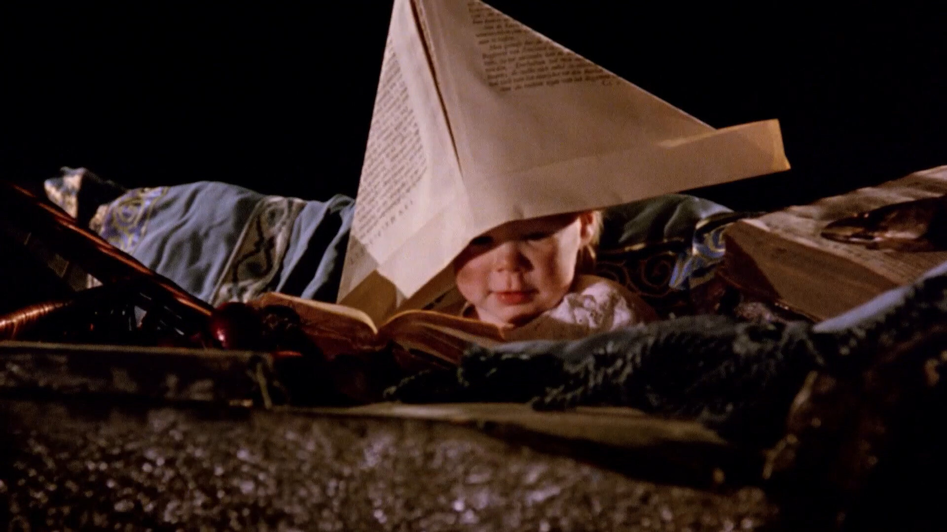
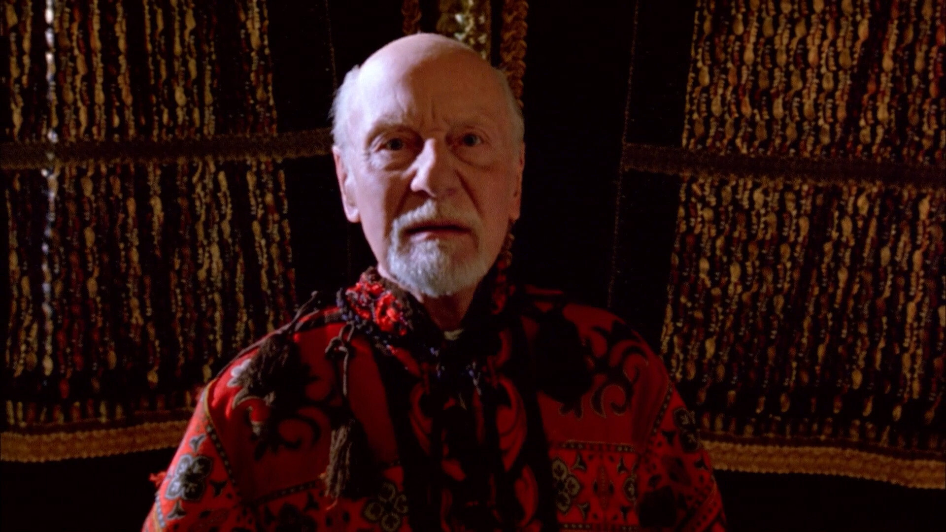
Nice hat.
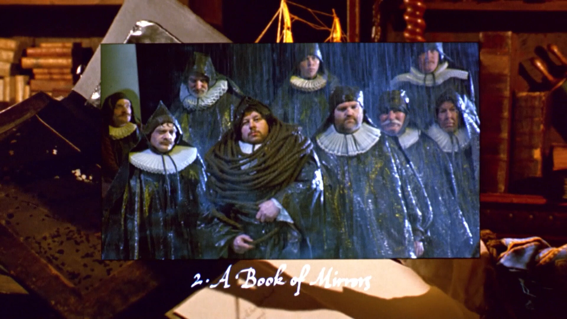
The resolution varies quite a lot between shots, like the above…
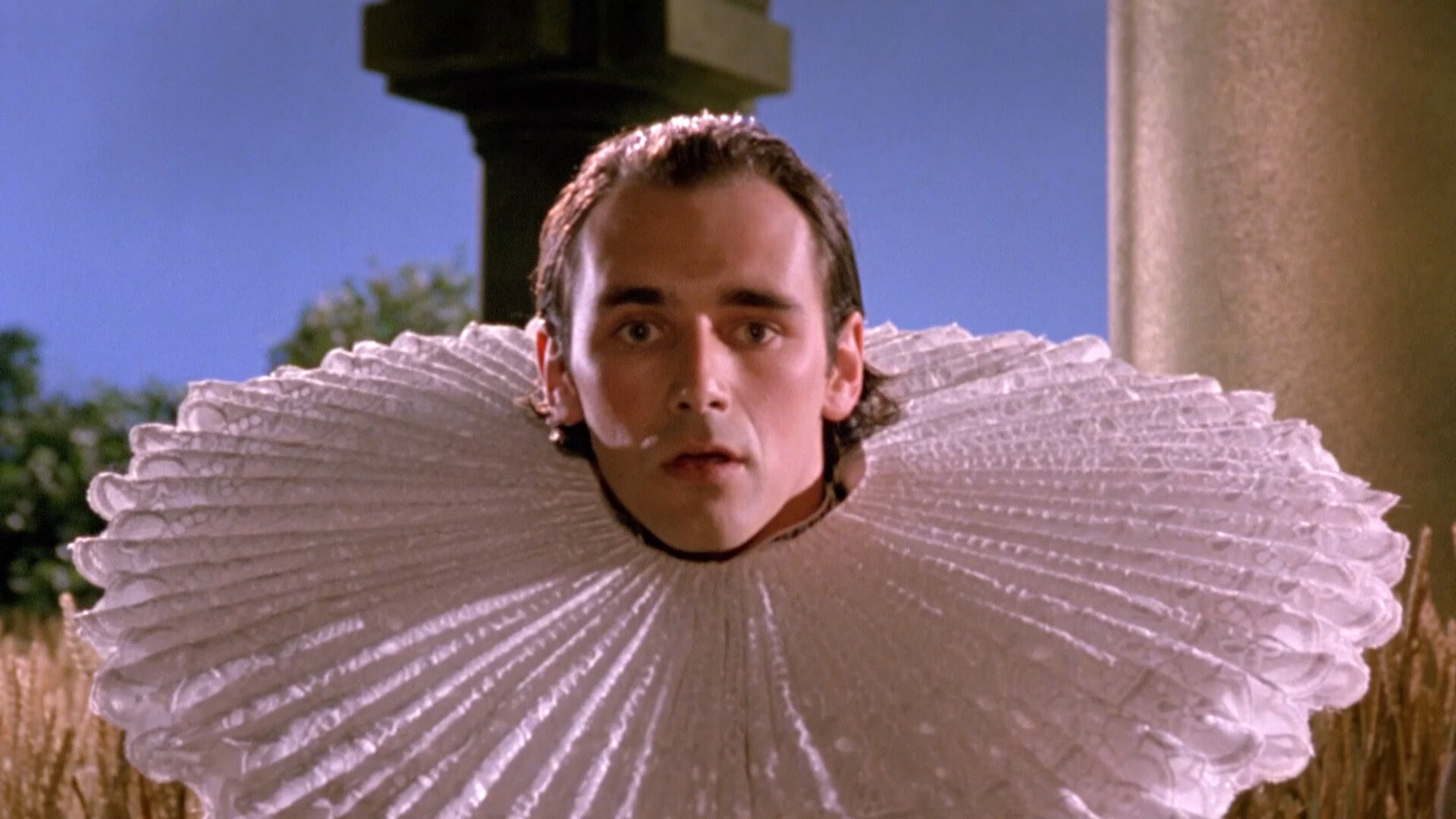
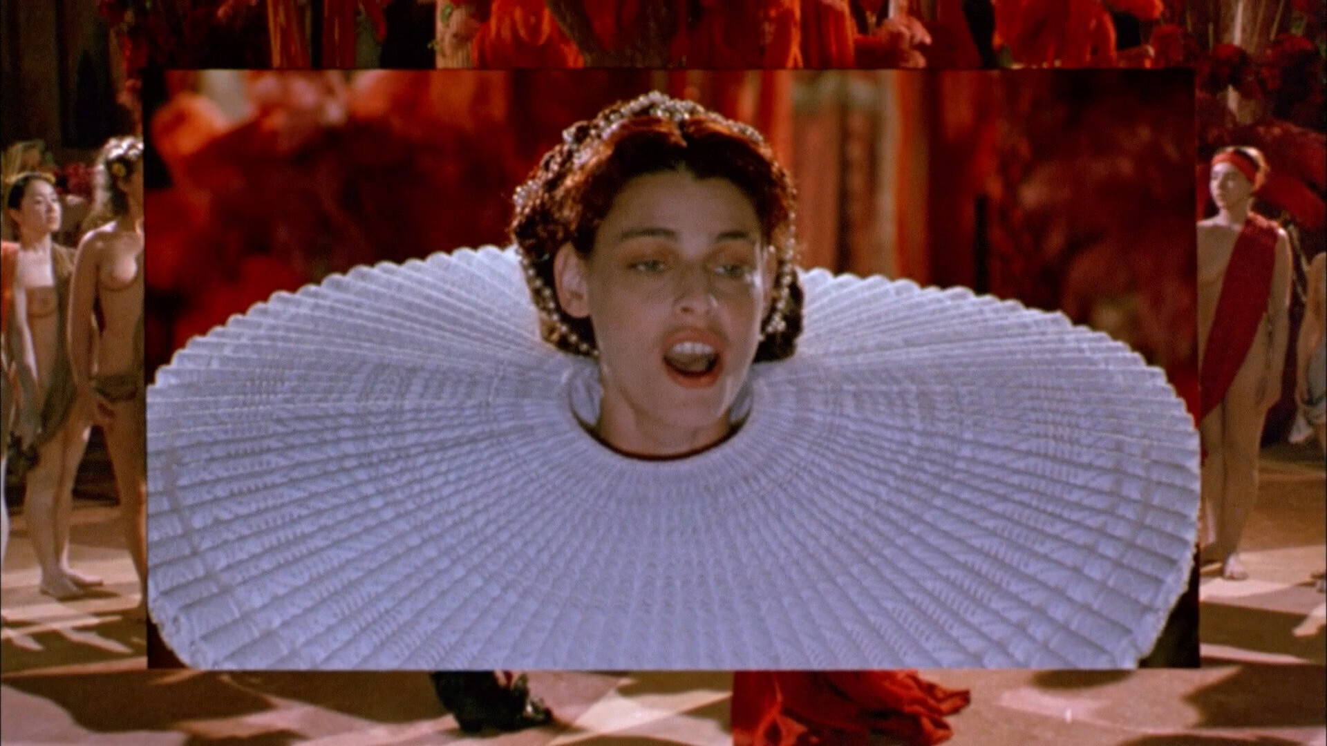
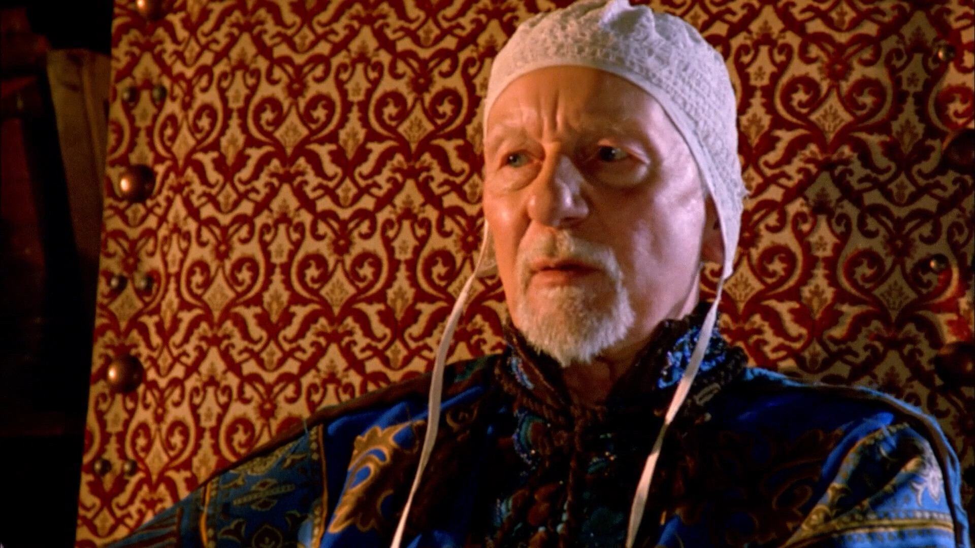
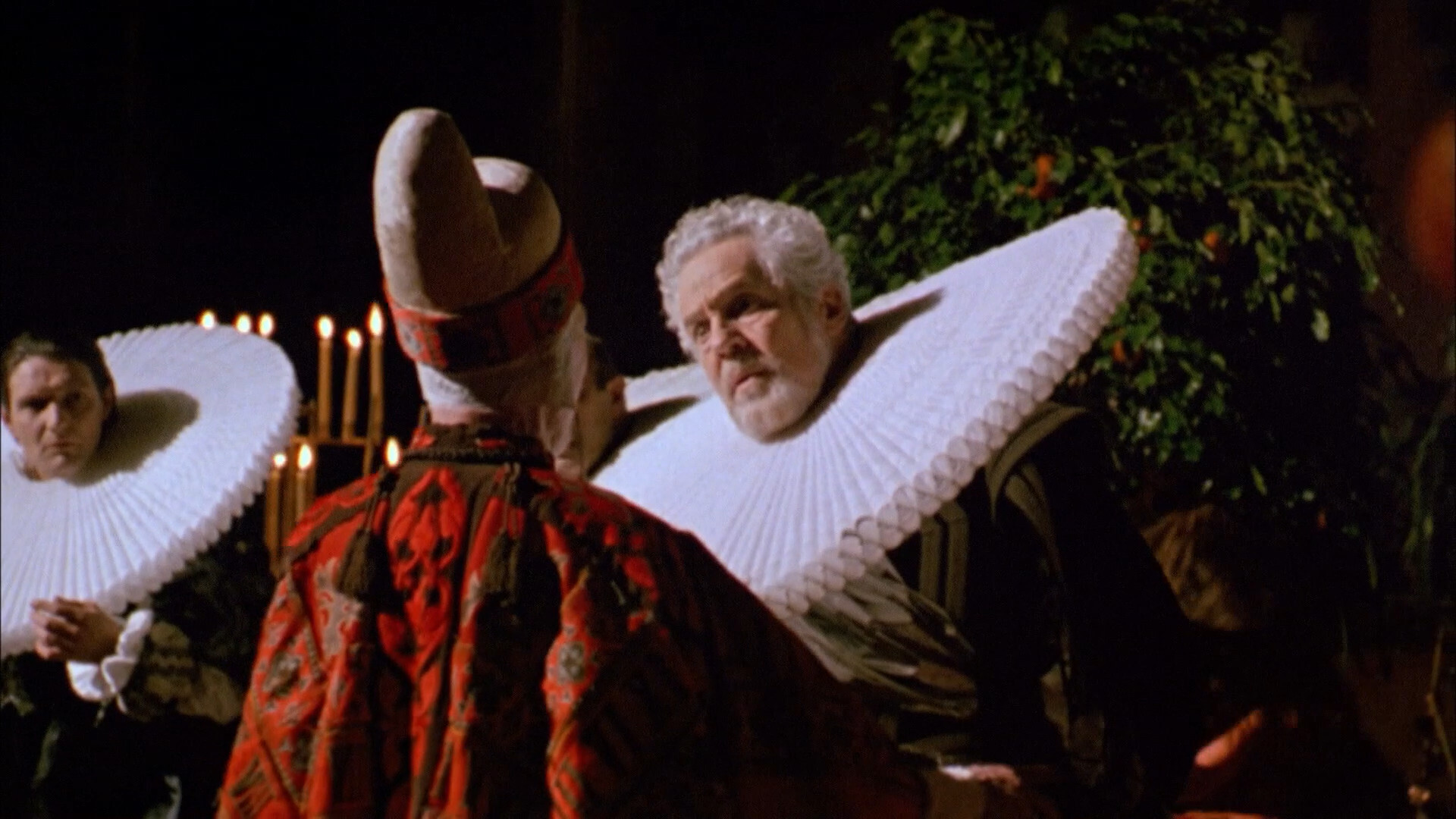
… and this one, which looks pristine. (Nice collar.) I’m guessing some of the shots didn’t go through the Hi-Vision process..
Oh, I remember this scene from the Jarman movie.
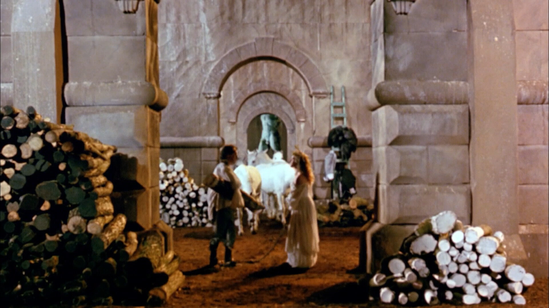
Horsies!
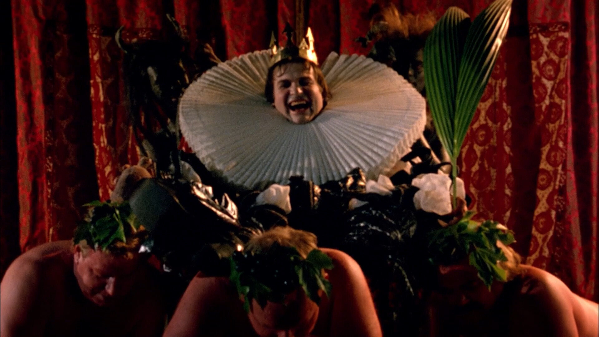
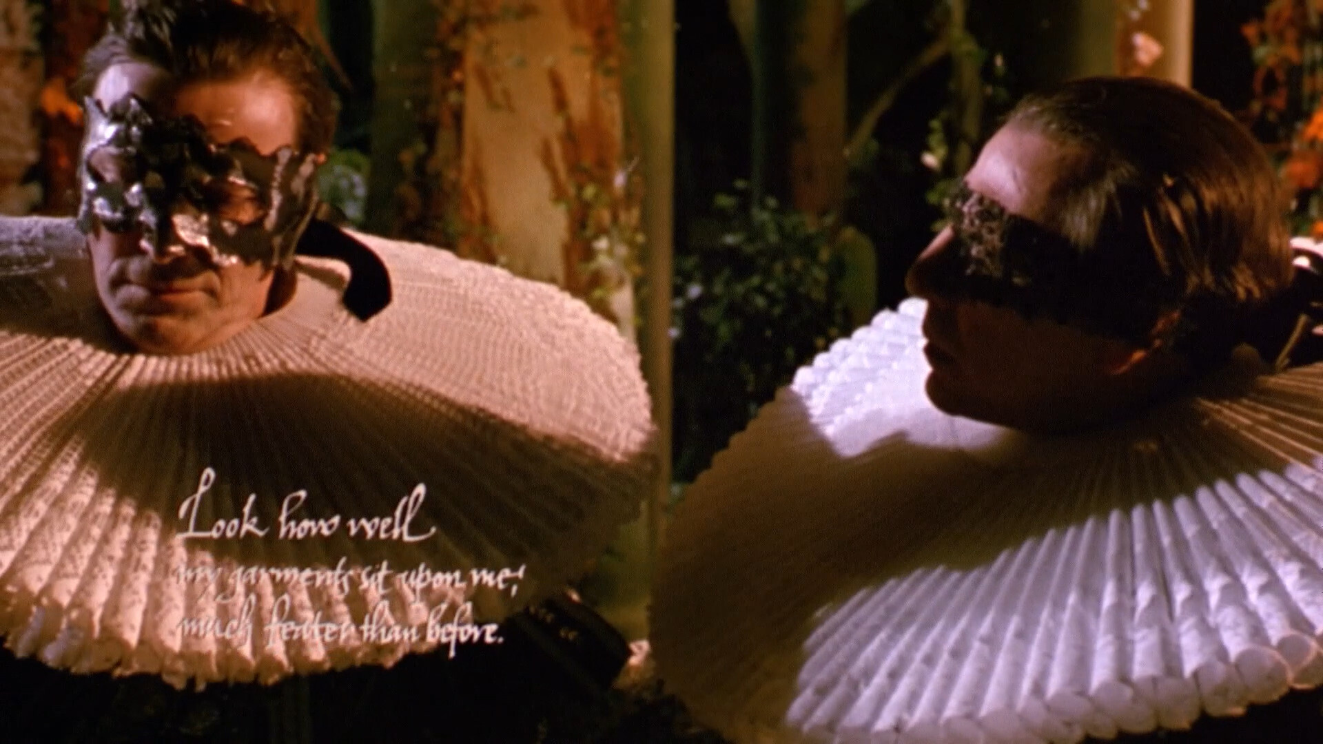
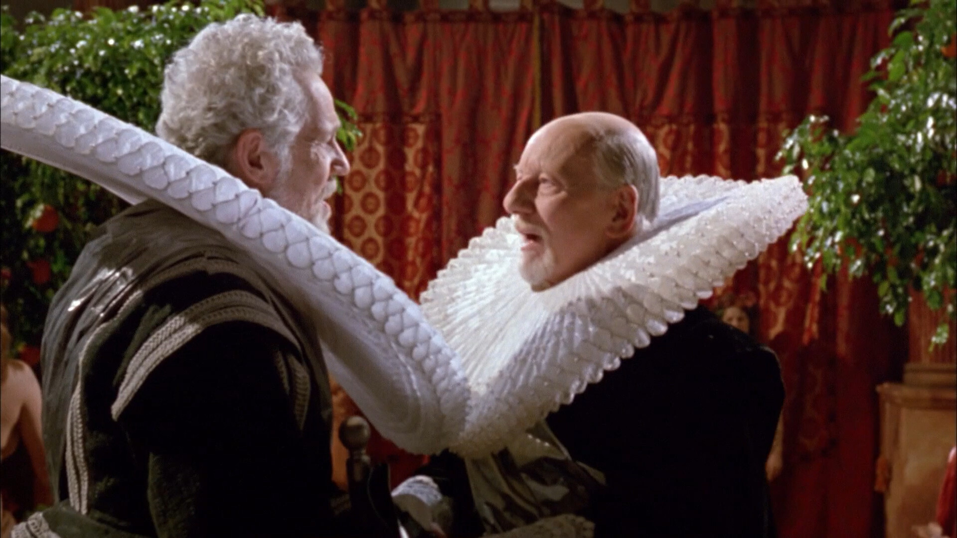
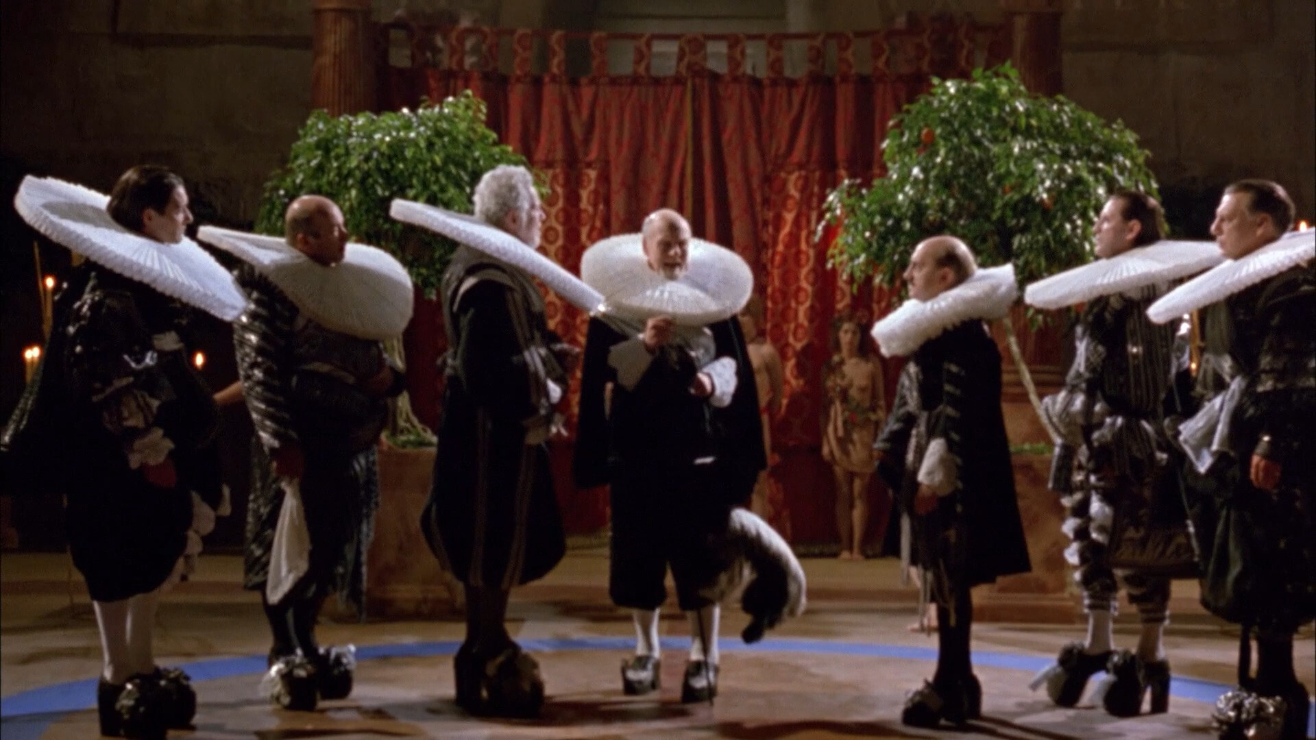
Even bigger collar!
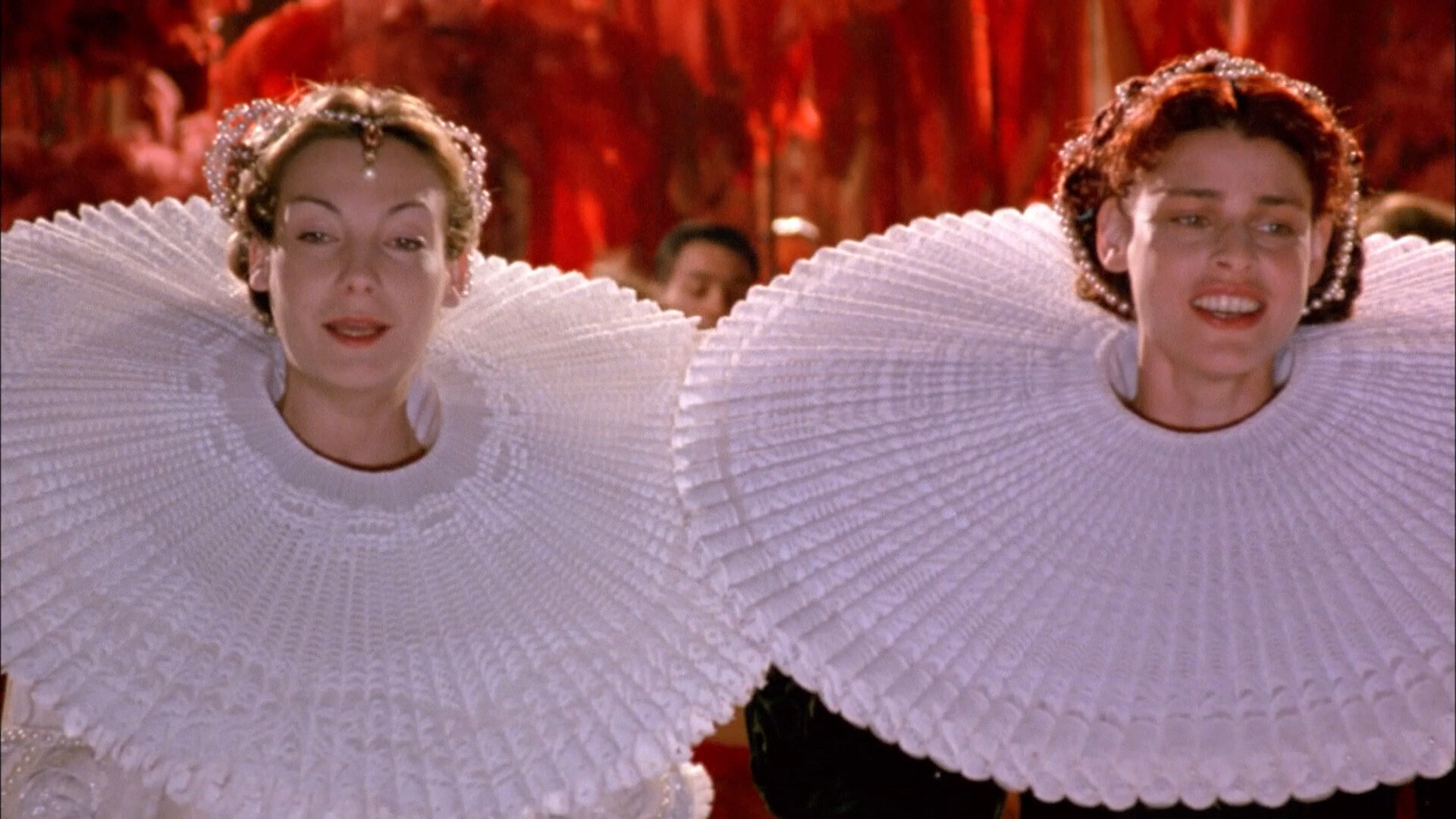
BIGGEST COLLARS
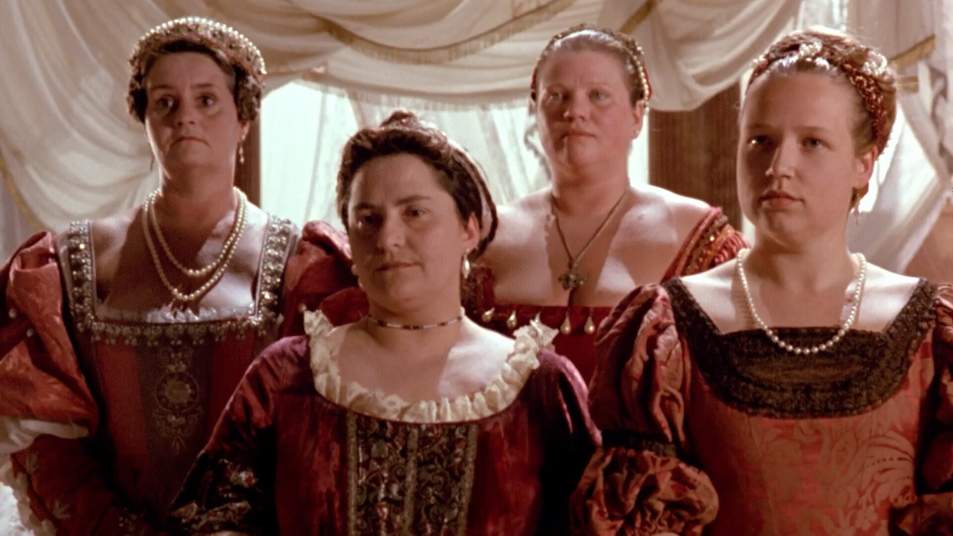
This was probably the longest scene? It’s the wedding scene (sort of) and they did an entire Michael Nyman lieder, and it was great. I’m not really a Nyman fan, but that was a really good one.
And this was the last time Greenaway and Nyman collaborated — and I wonder whether that was because Nyman saw the writing on the wall: That Greenaway was never actually going to er break through. Their previous movie was The Cook, the Thief, His Wife & Her Lover, which was Greenaway’s most commercially successful movie ever. And this movie is wilfully obscure; like Greenaway purposefully wants to piss off any fans he might have picked up with that movie.
Is that Erland Josephson? Yes! It is! (Nice collar.)
(Hopefully the Russians won’t find this screenshot…)
Nice shoes!
Yeah, OK, sometimes the effects show their age…
This movie has a 62% tomatometer, which I think is the perfect score. If at least not one third of people hate your movie, you’re doing something wrong.
I think it’s brilliant. It’s like a culmination of all the what Greenaway tried to do in the 80s, but wasn’t quite able to pull off before this.
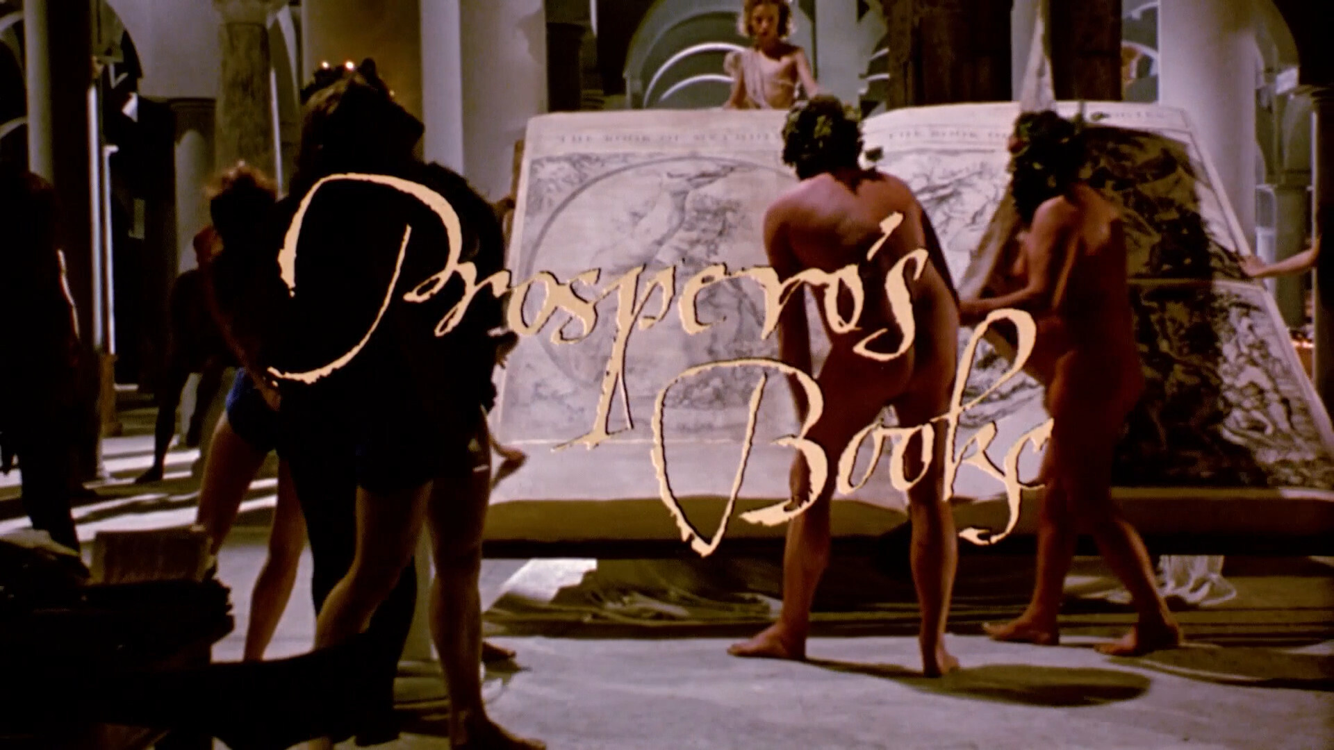
Prospero’s Books. Peter Greenaway. 1991. ⚅
[Edit:]
Oh yeah. This eight (!) minute news item (!) confirms my guesses:

But it also has more info. The budget for the movies was indeed 1.5M… but the Japanese were so excited about it that they donated 2M (!) worth of work to it. So a typical scene had 35mm (shot in Amsterdam), digital overlays (books, etc) from the Quantel Paintbox, and also footage shot with TV cameras, all edited together on Hi-Vision analogue tape.
So making a higher def version of this sounds impossible.
Unless you get an AI to guess what the missing pixels ought to be.