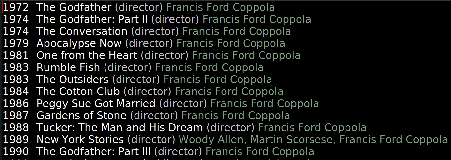
Oh! This is from 1990, while I and II were from 72 and 74… and bizarrely enough, there’s just 16 years between 90 and 74 — it seems like it should be 26 years? It’s like a different era…
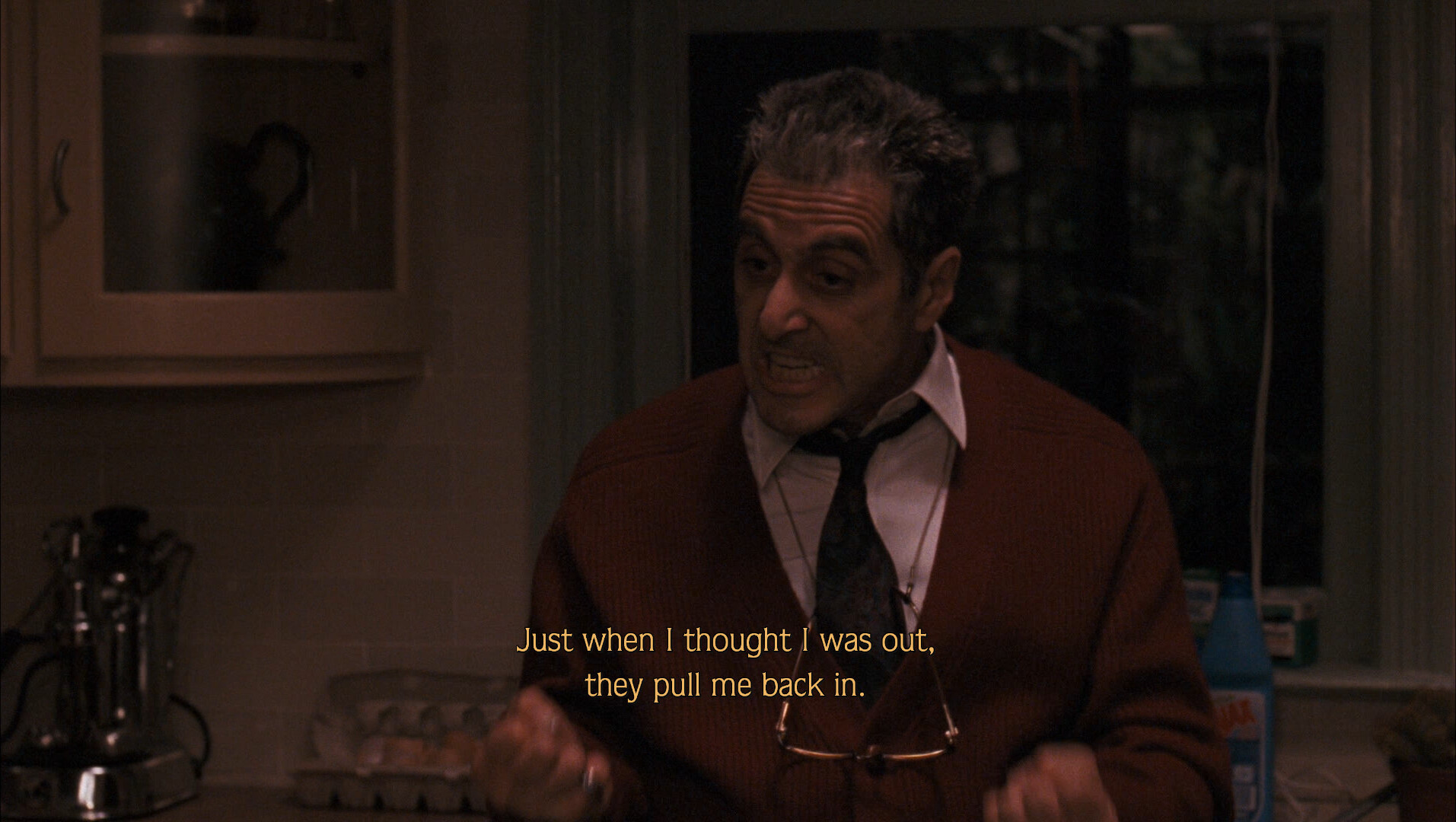
This is like a callback to the first movie? The party and the mob boss doing his bossy stuff?
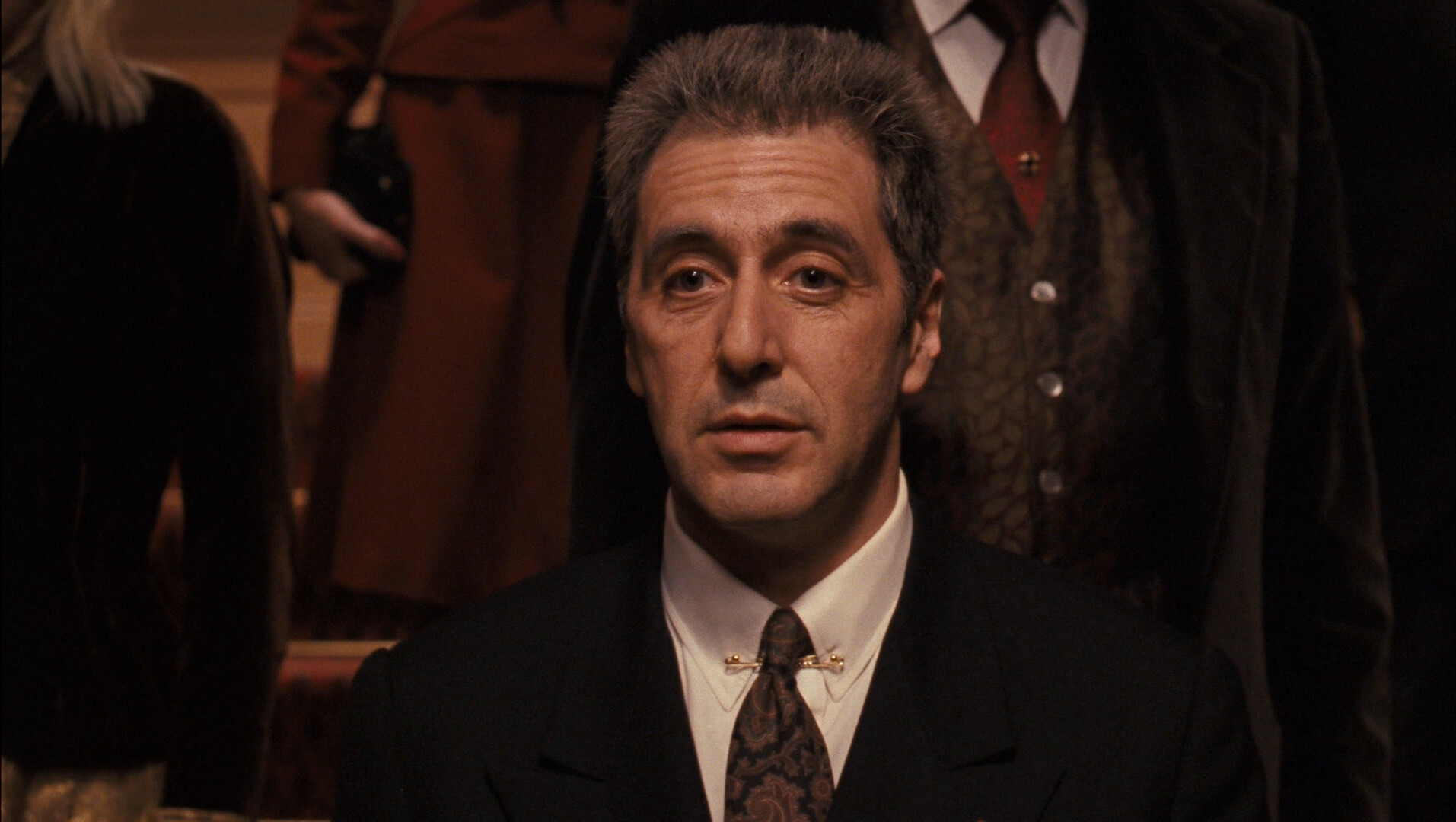
But… I love Pacino, but he’s not Marlon Brando.
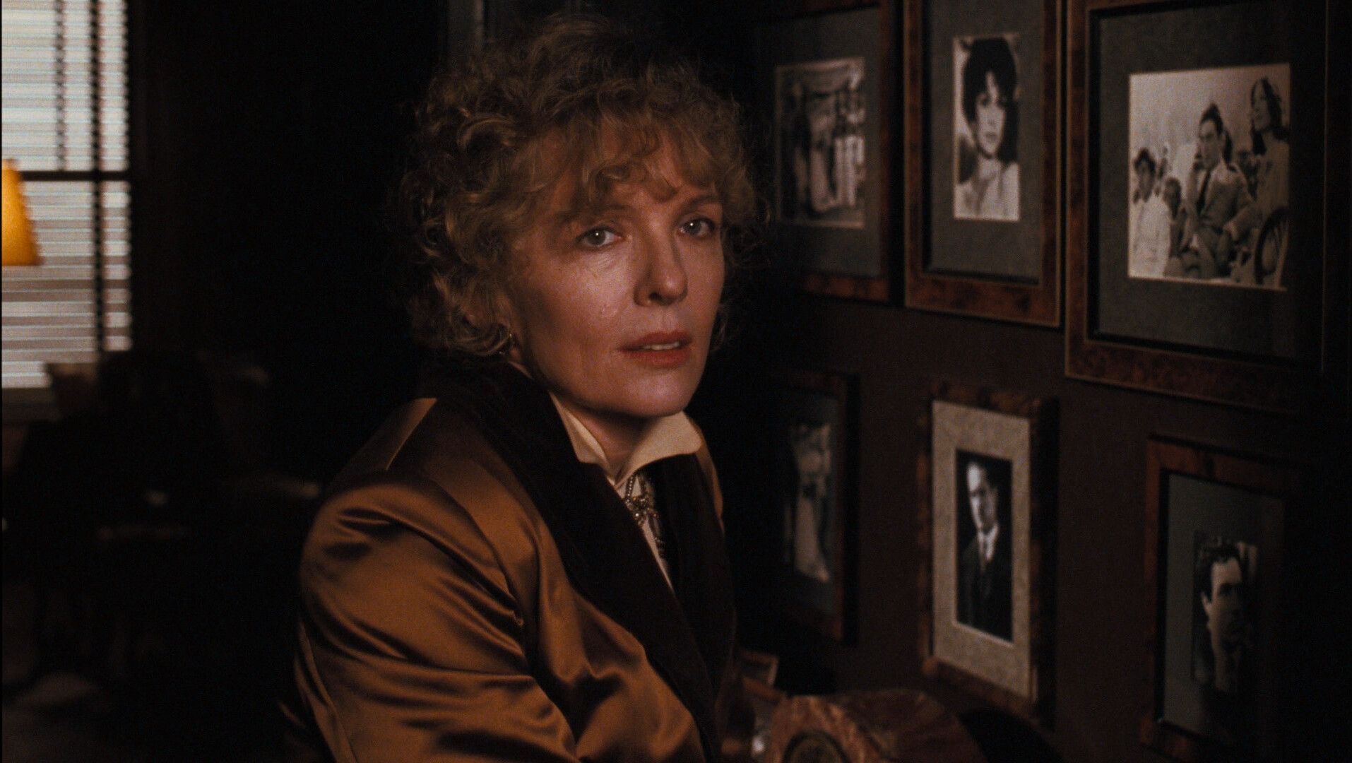
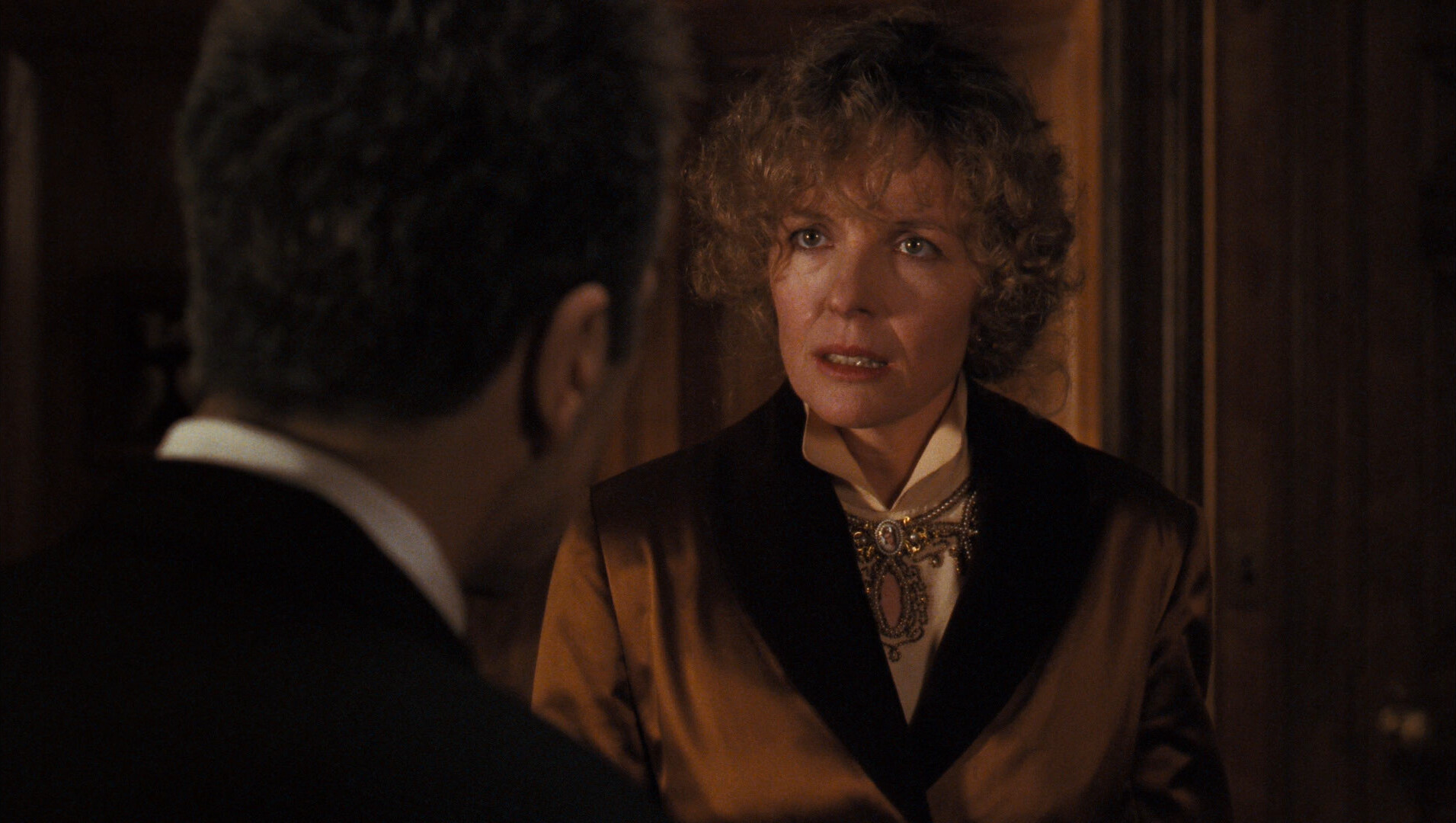
But it’s not the actors — this has got Dianne freaking Keaton, and the lines just seem so …
What’s the technical term…
Moronic?
I think that’s the technical term?
No actor can salvage these lines.
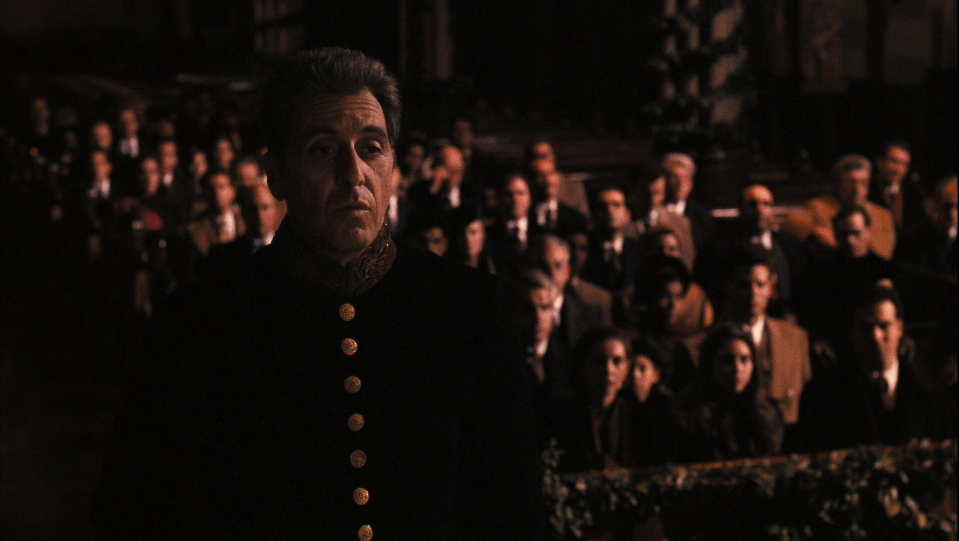
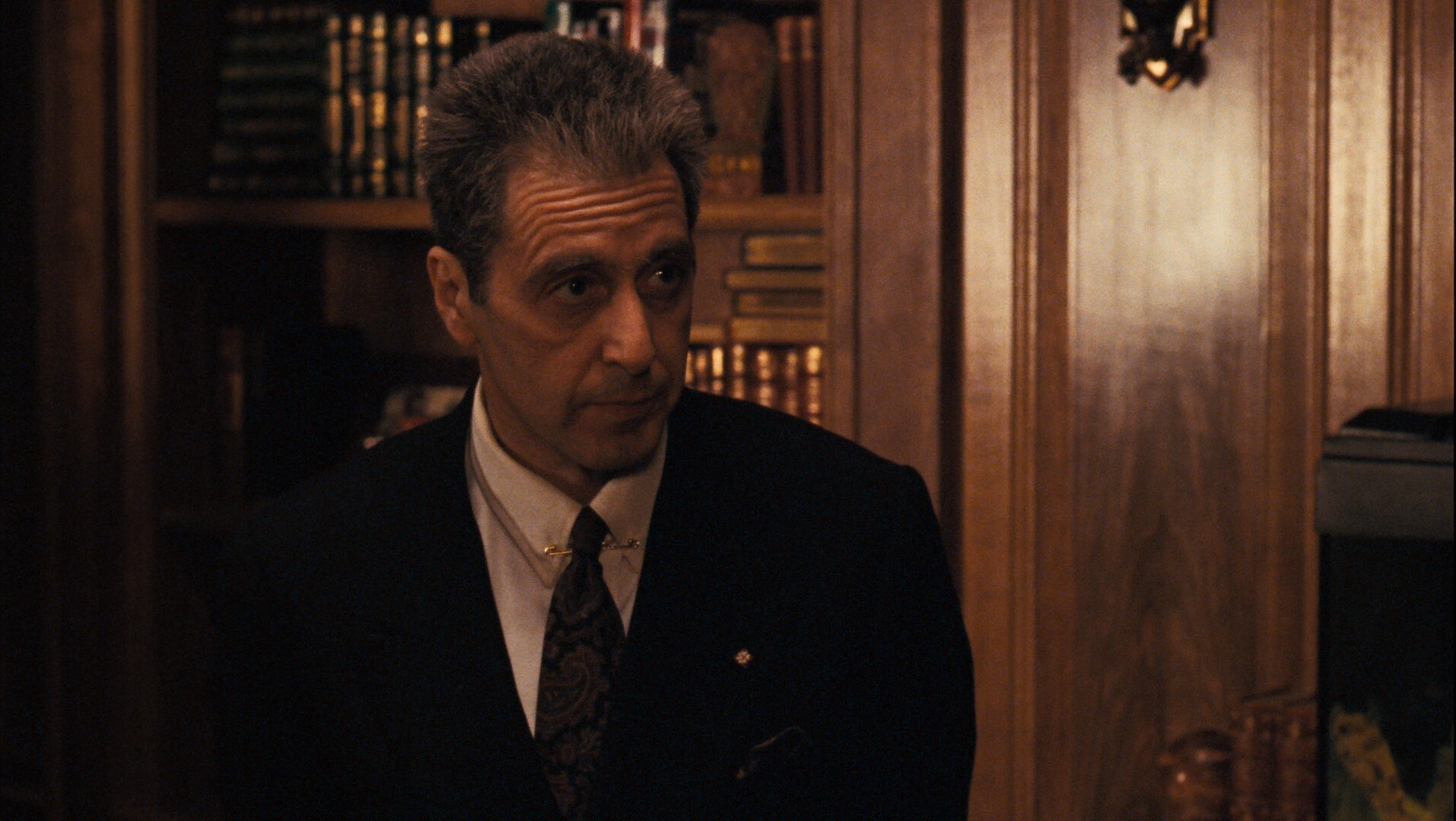
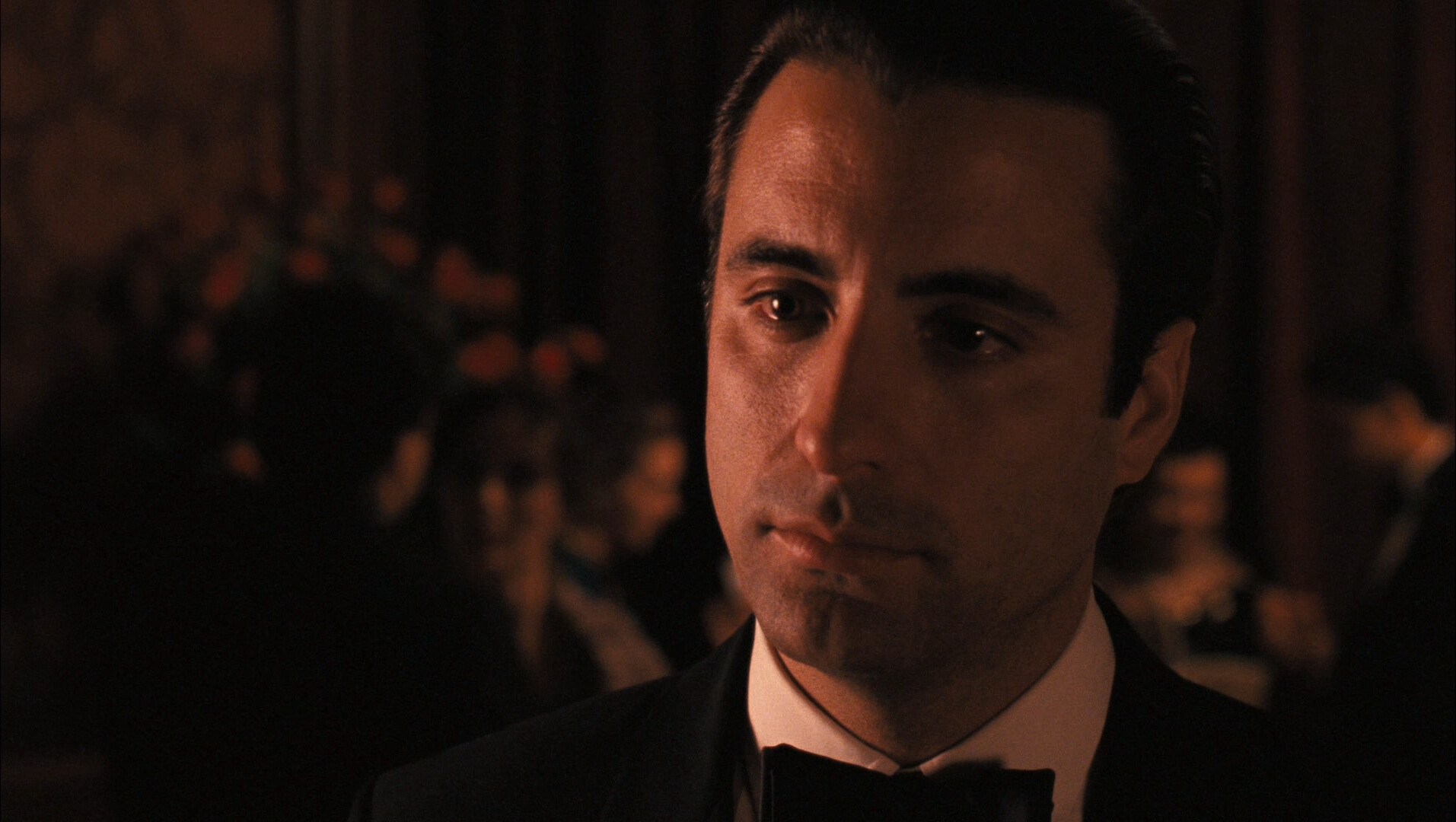
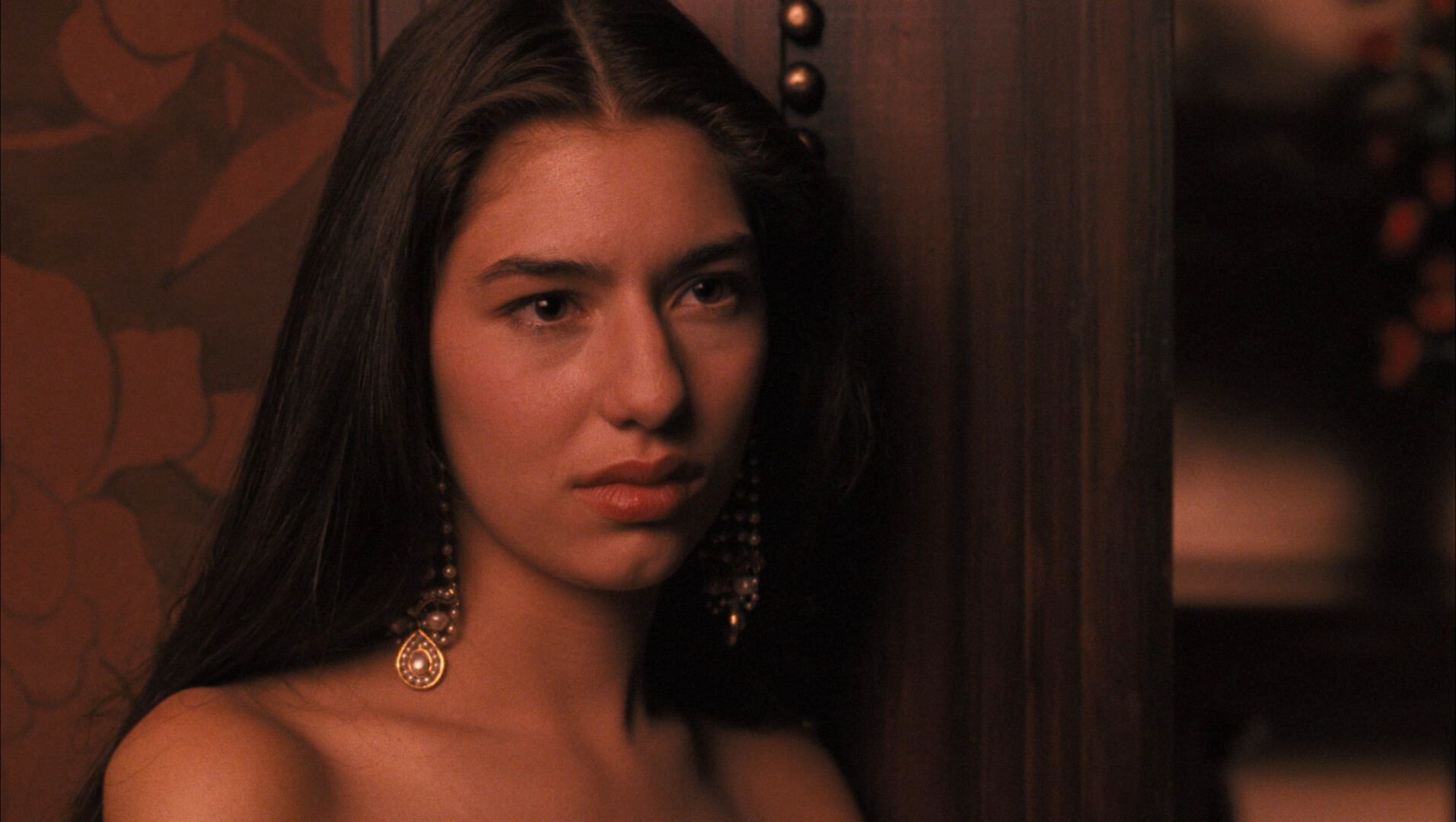
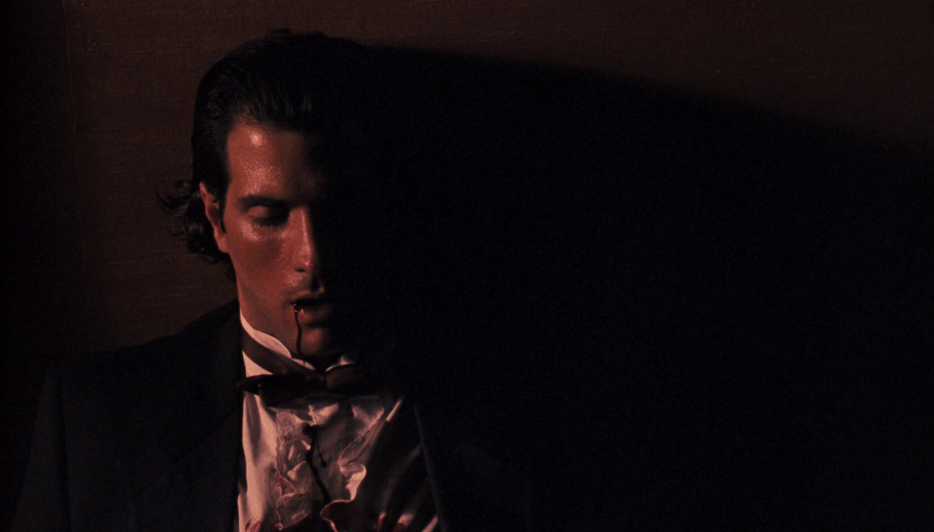
It’s hard to say just why this movie sucks this much. It’s just… an accumulation of defects? The cinematography is so pedestrian that it’s just… did anybody claim credits for this? Every shot is “yes, that sucks”. Even the colour grading is just bad.
The lines suck, the actors showed up, there’s no plot worth paying attention to…
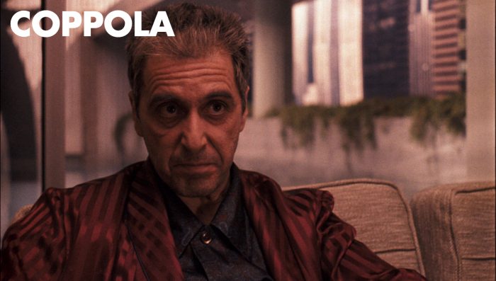
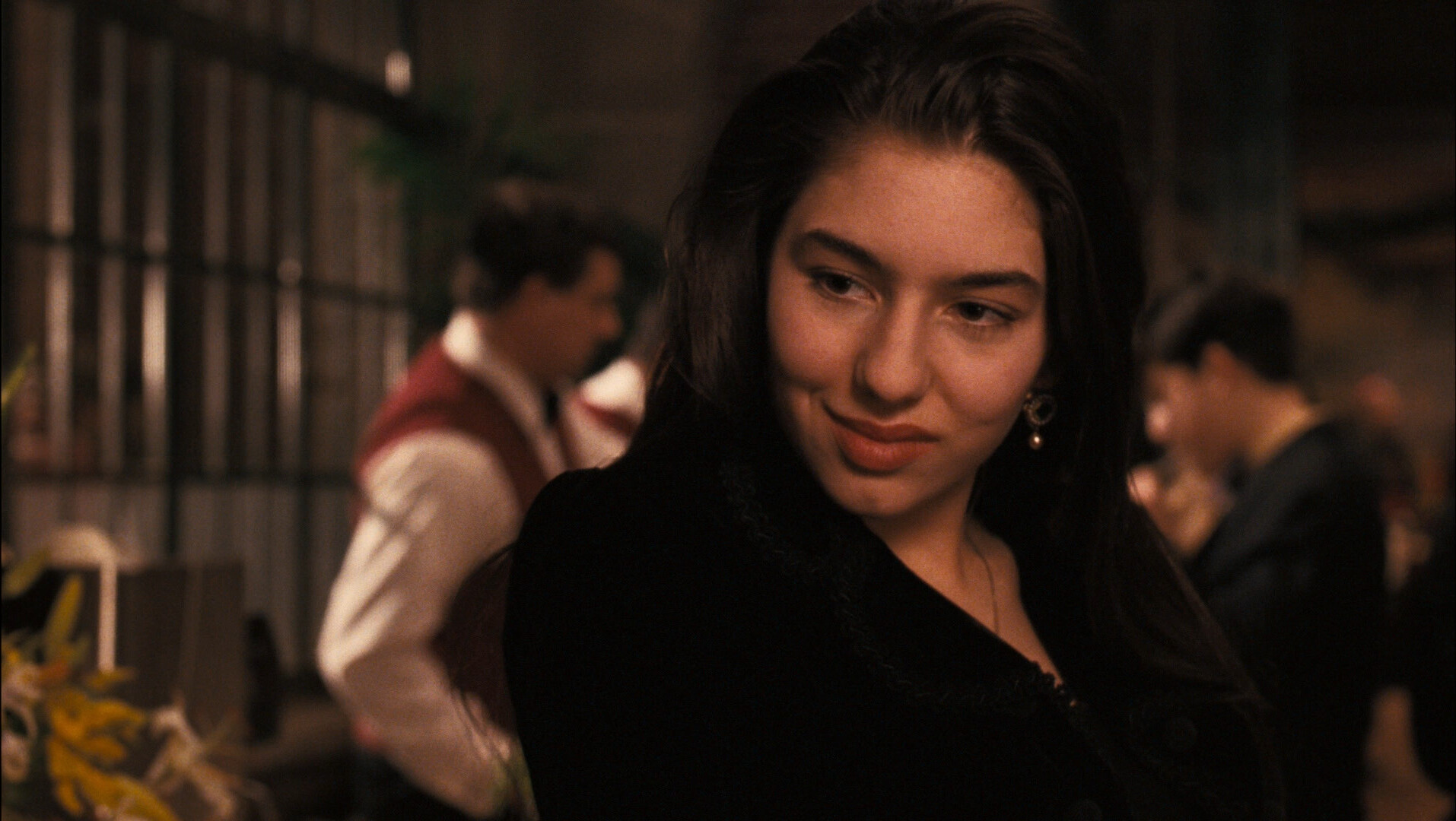
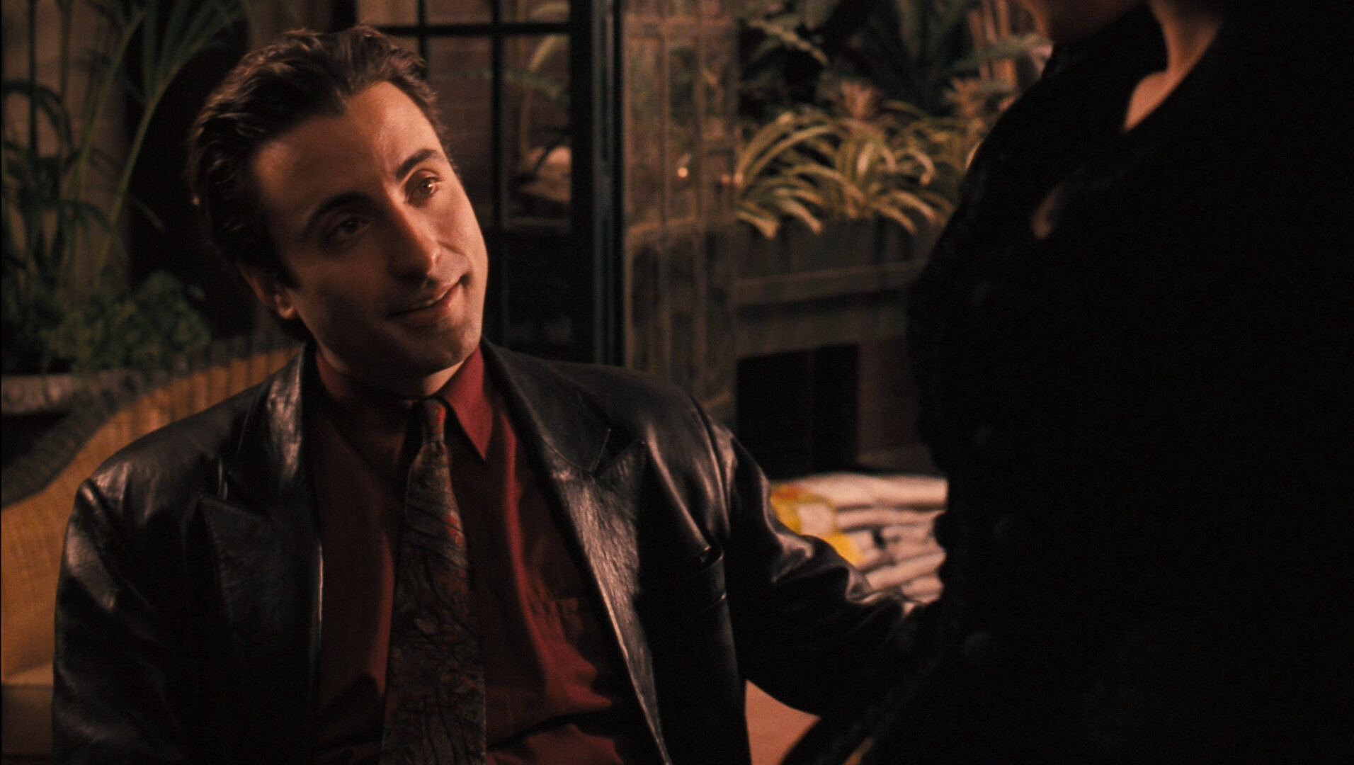
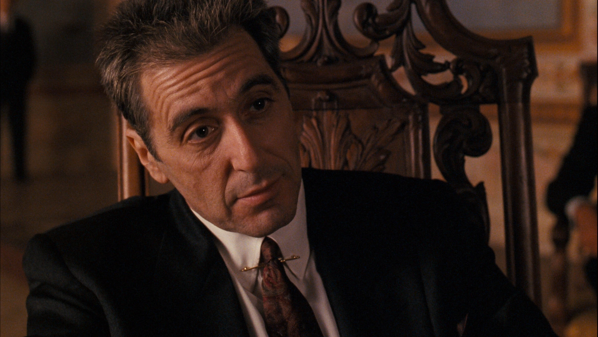
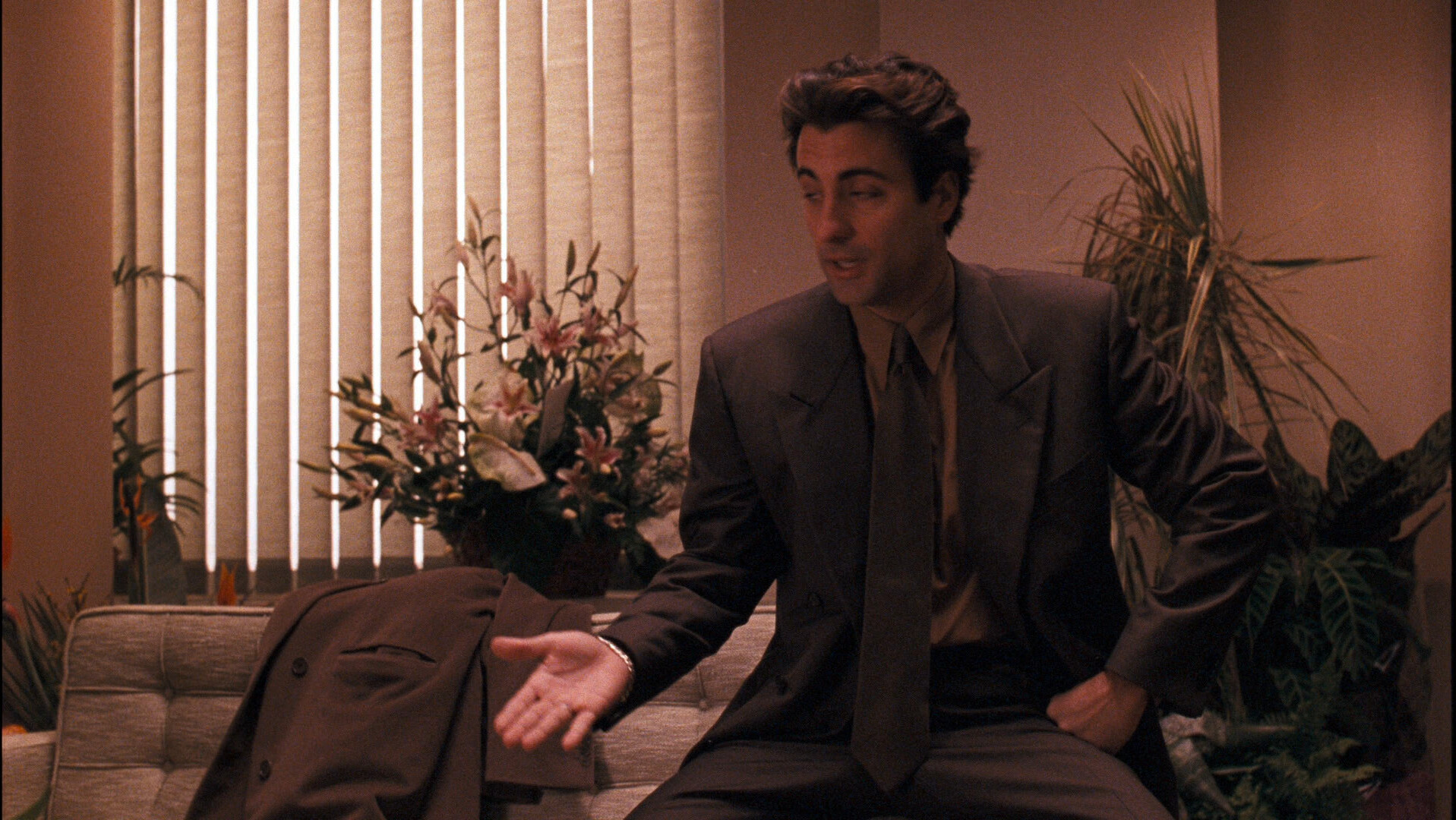
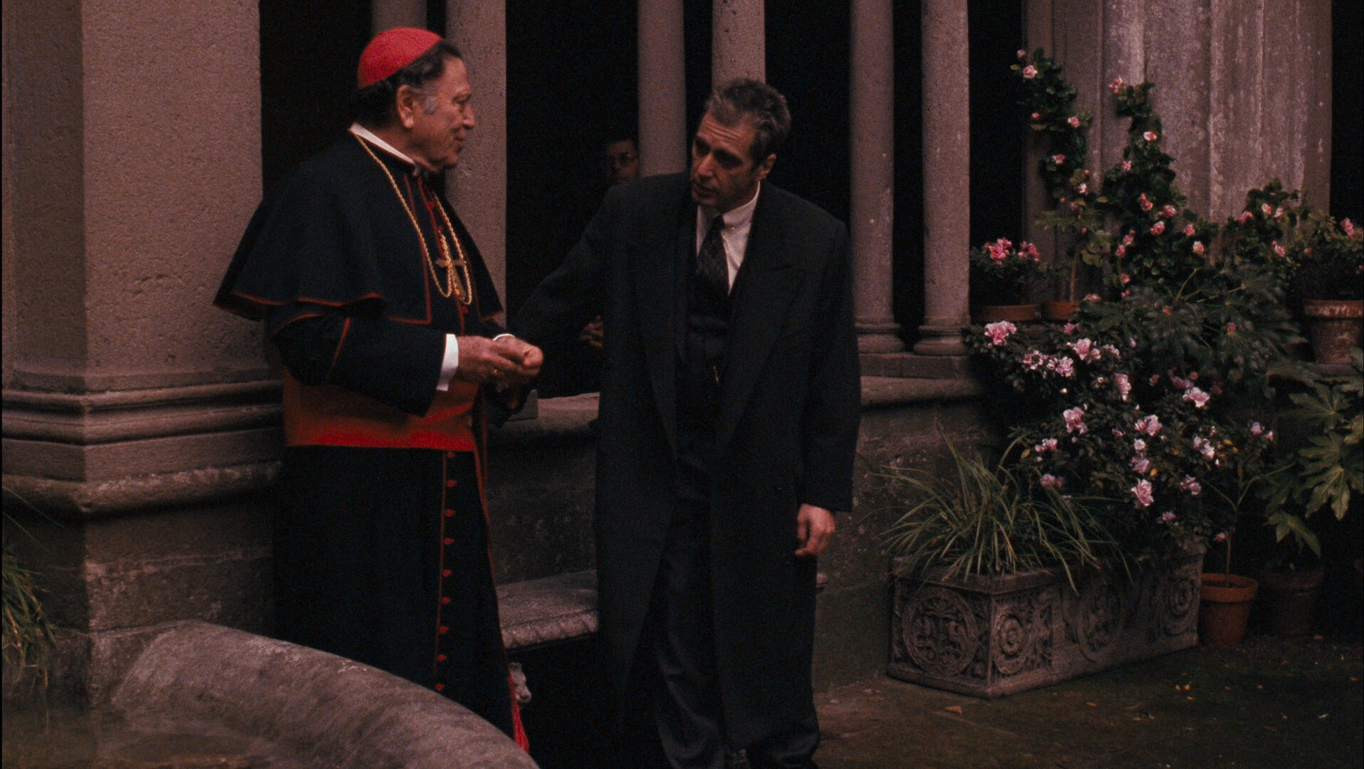
Look at that shot. It’s so ugly that the only reasonable explanation is that Coppola made this movie to atone for his sins: He made mobsters look cool in the first two movies, so he’s trying to make them look like the total dorks they are in this movie.
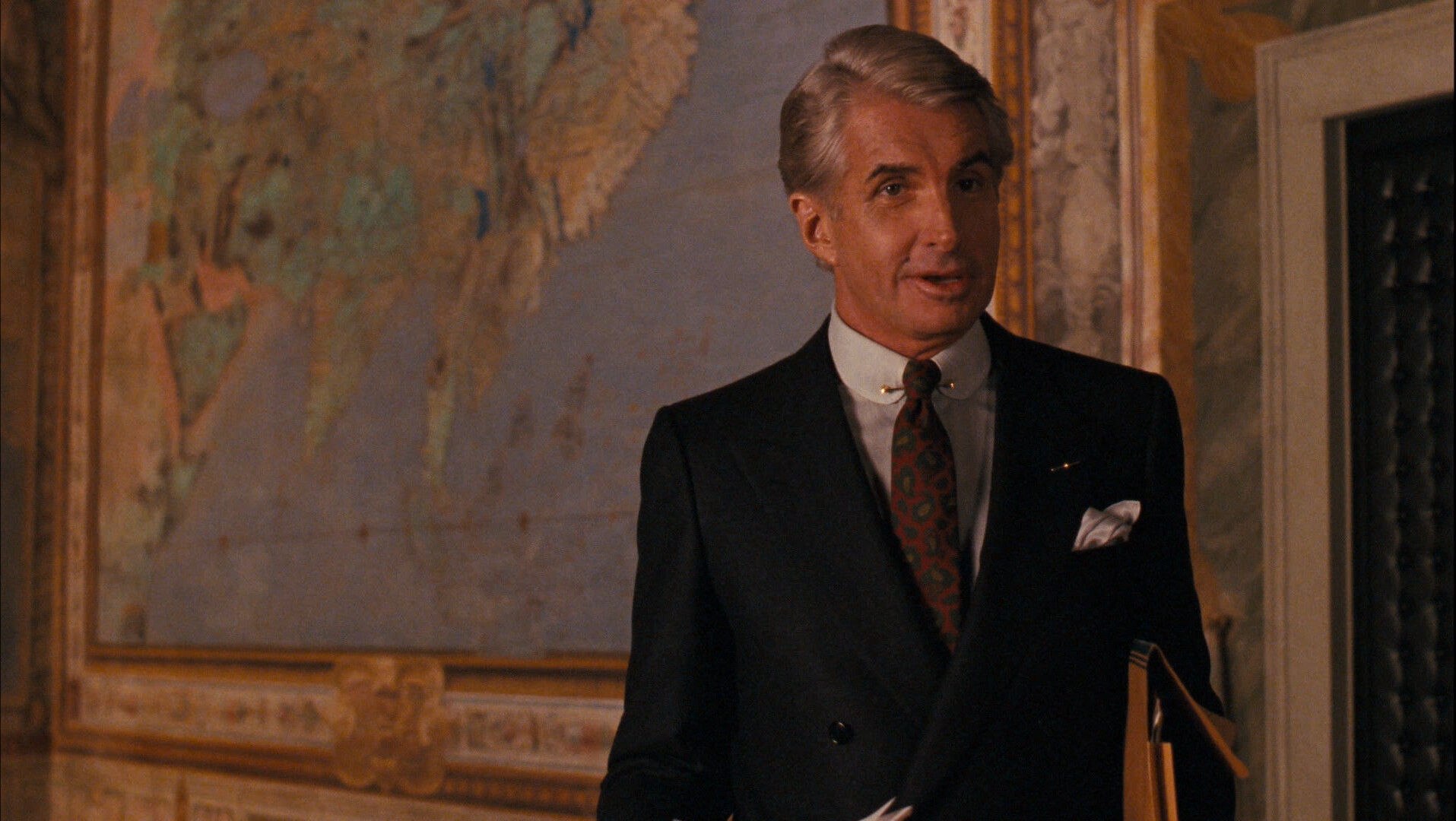
I just don’t understand this movie — what’s George Hamilton doing here? It feels like a movie that has had a few hours cut out of it, and it’s three hours long.
Perhaps this was just a movie ahead of its time? It could have been a twelve episode New Era of Quality TV series and it would have been hailed as a masterpiece.
Wow… Coppola had done a lot of… stuff… between II and III. I think… mostly now critically well received? I’ve seen all these movies, and… er… I think I loved One From The Heart at the time? I was 13? And the rest are… what they are…
It’s so pedestrian. I can’t get over it.
And I totally don’t understand what the point of the Vatican plot is, except that it’s saying “these mobster people sure are stupid”.
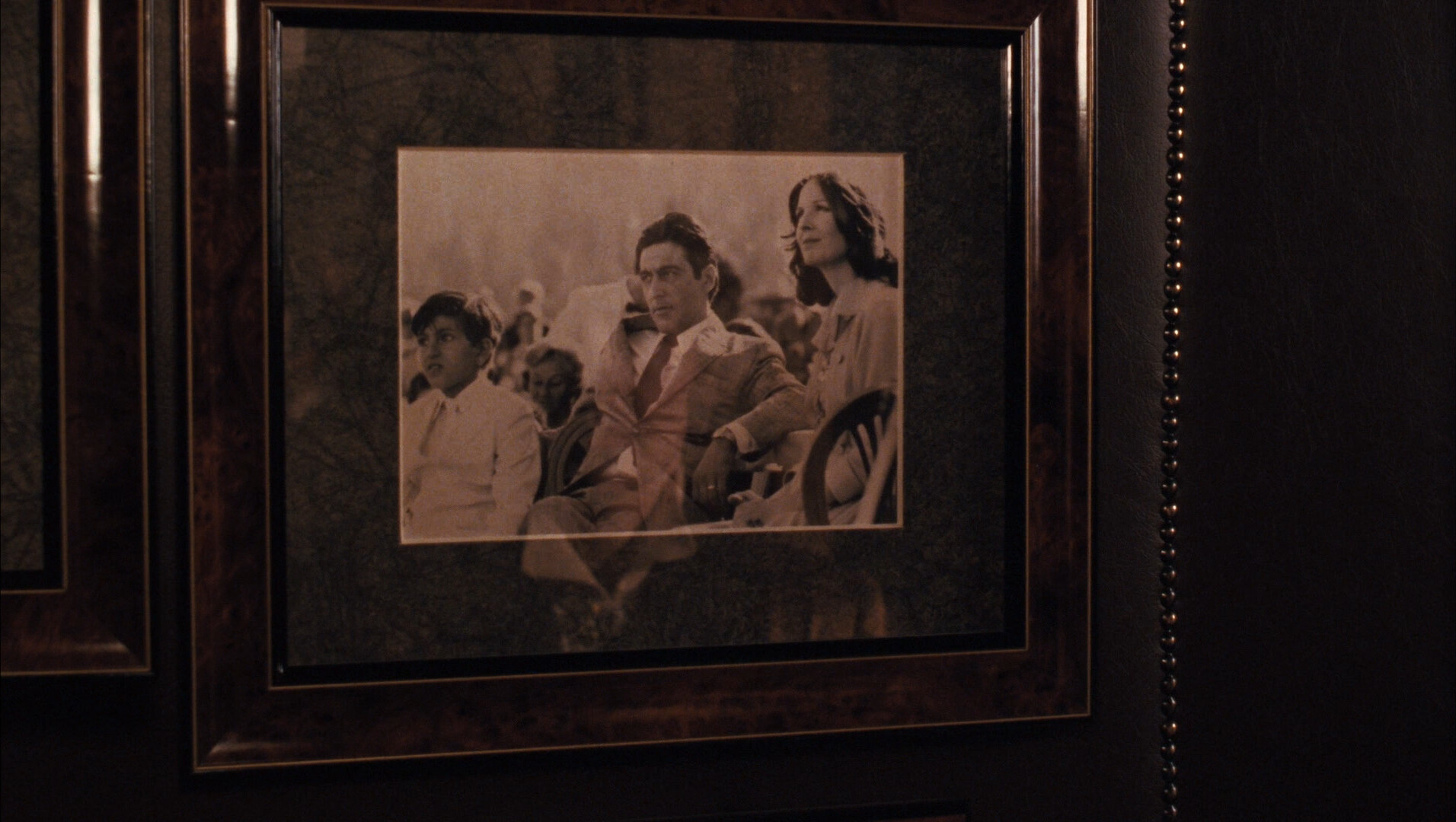
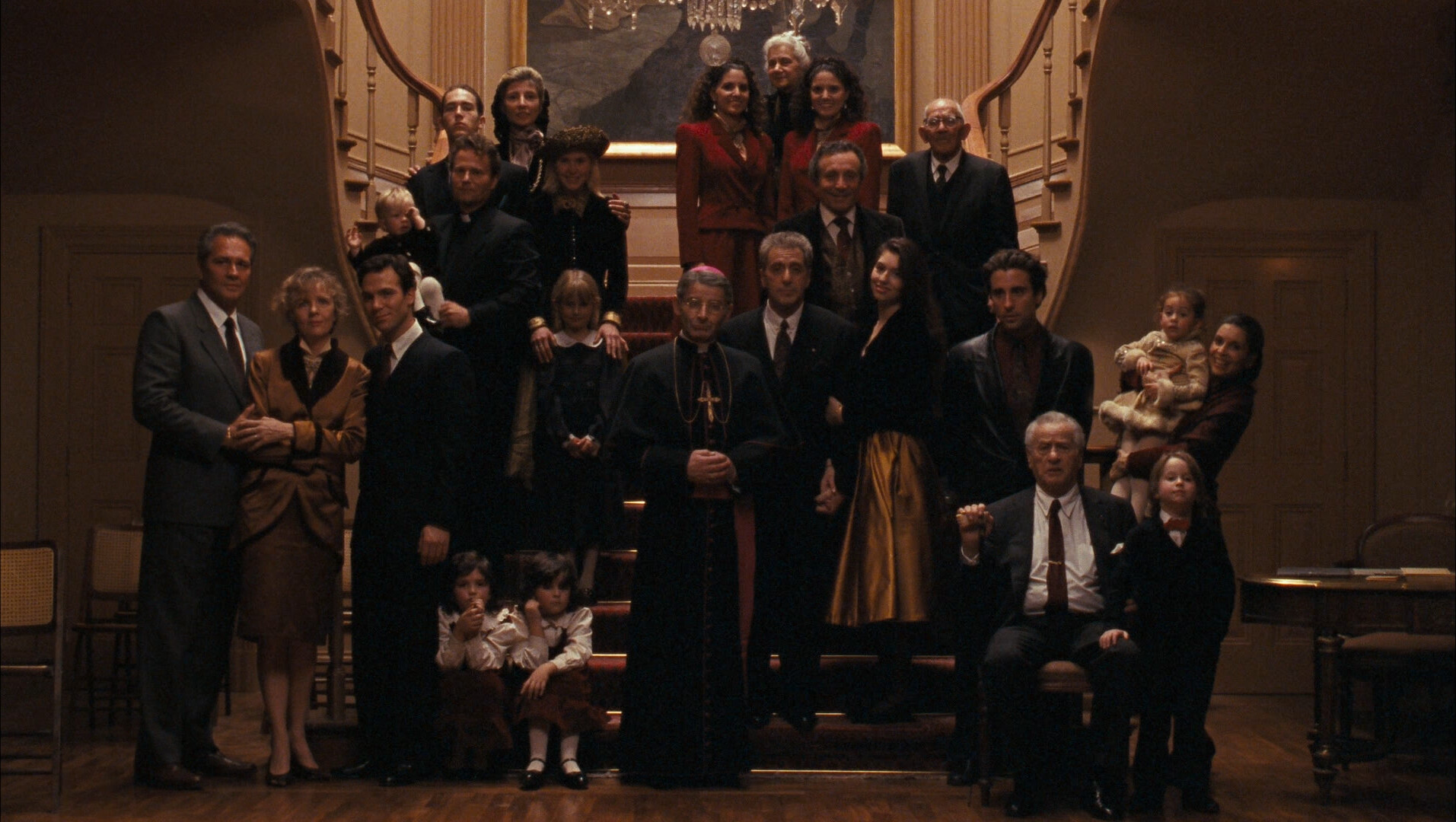
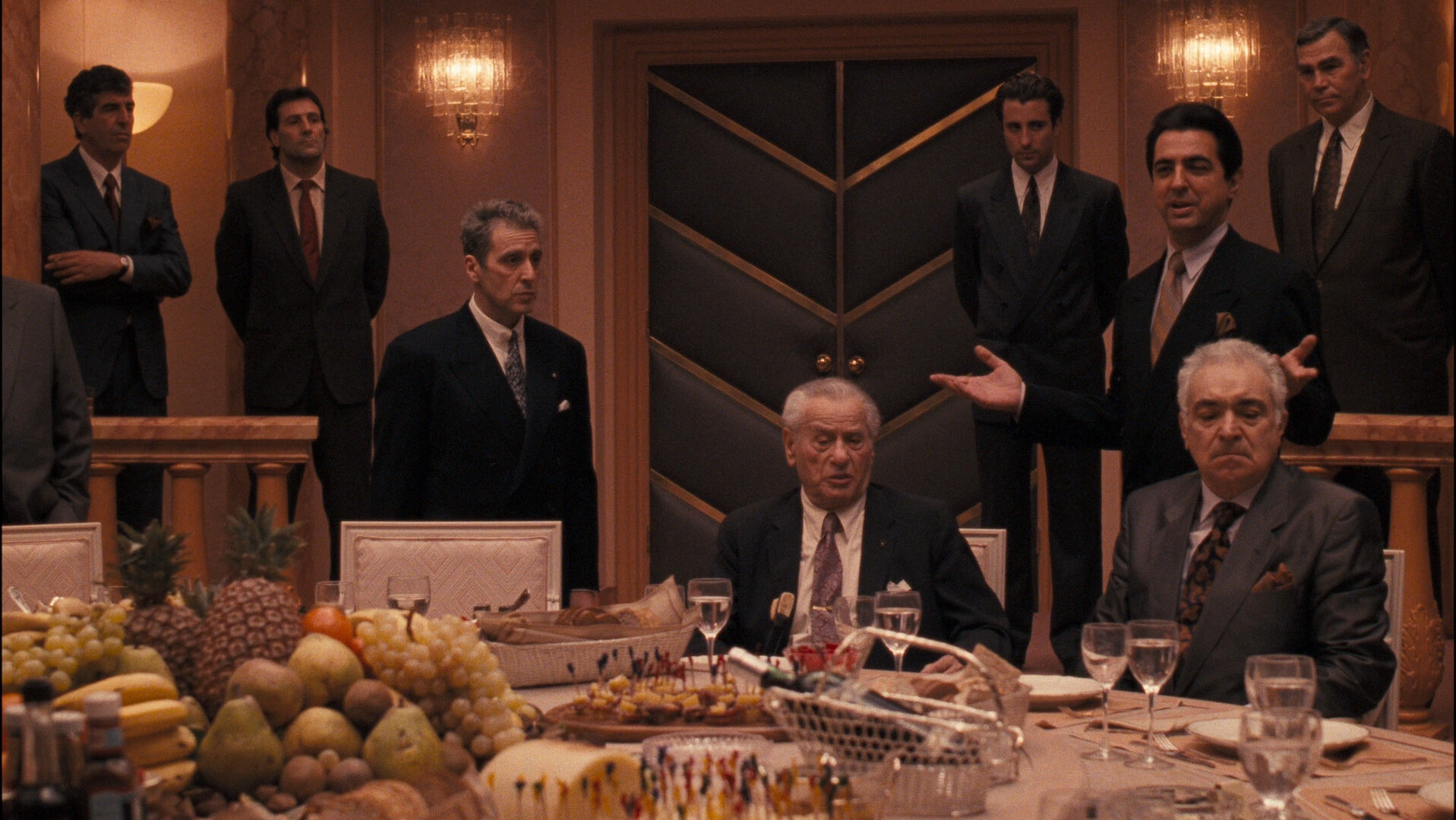
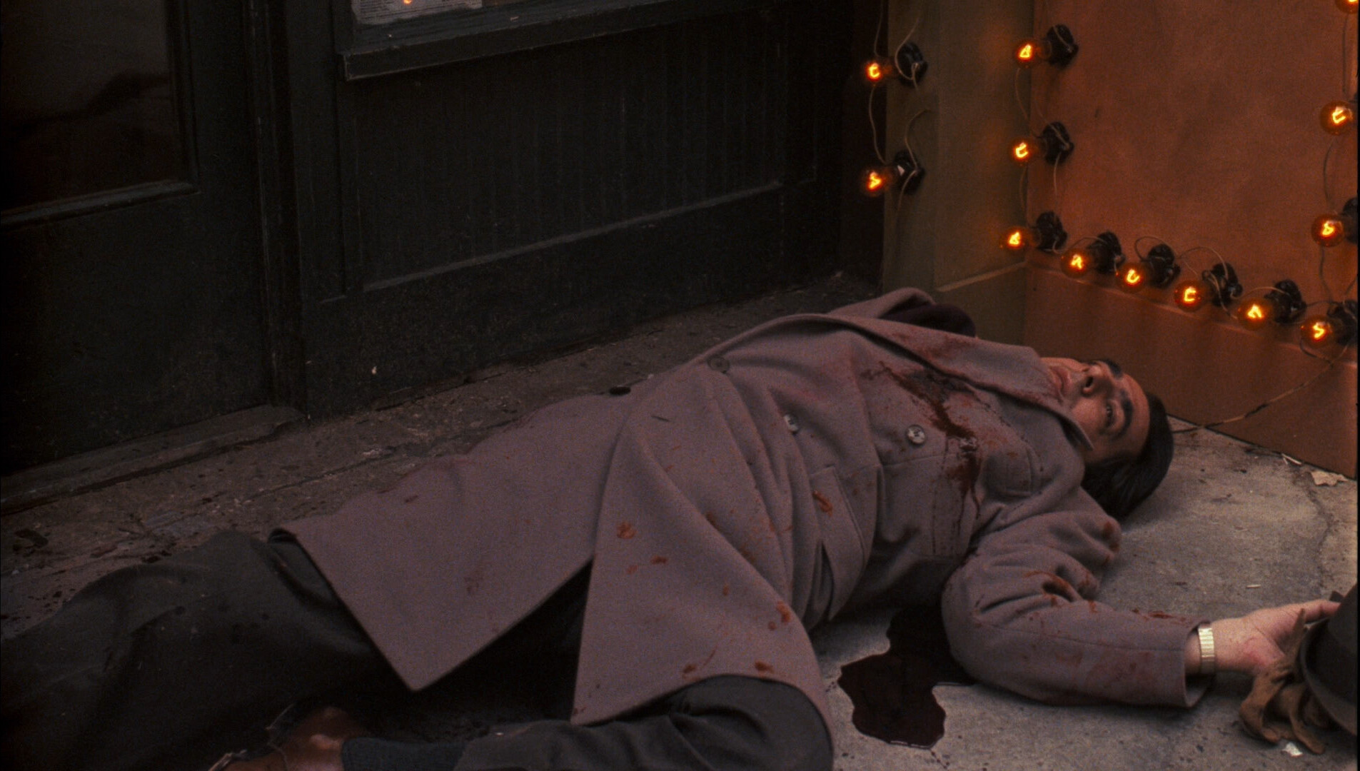
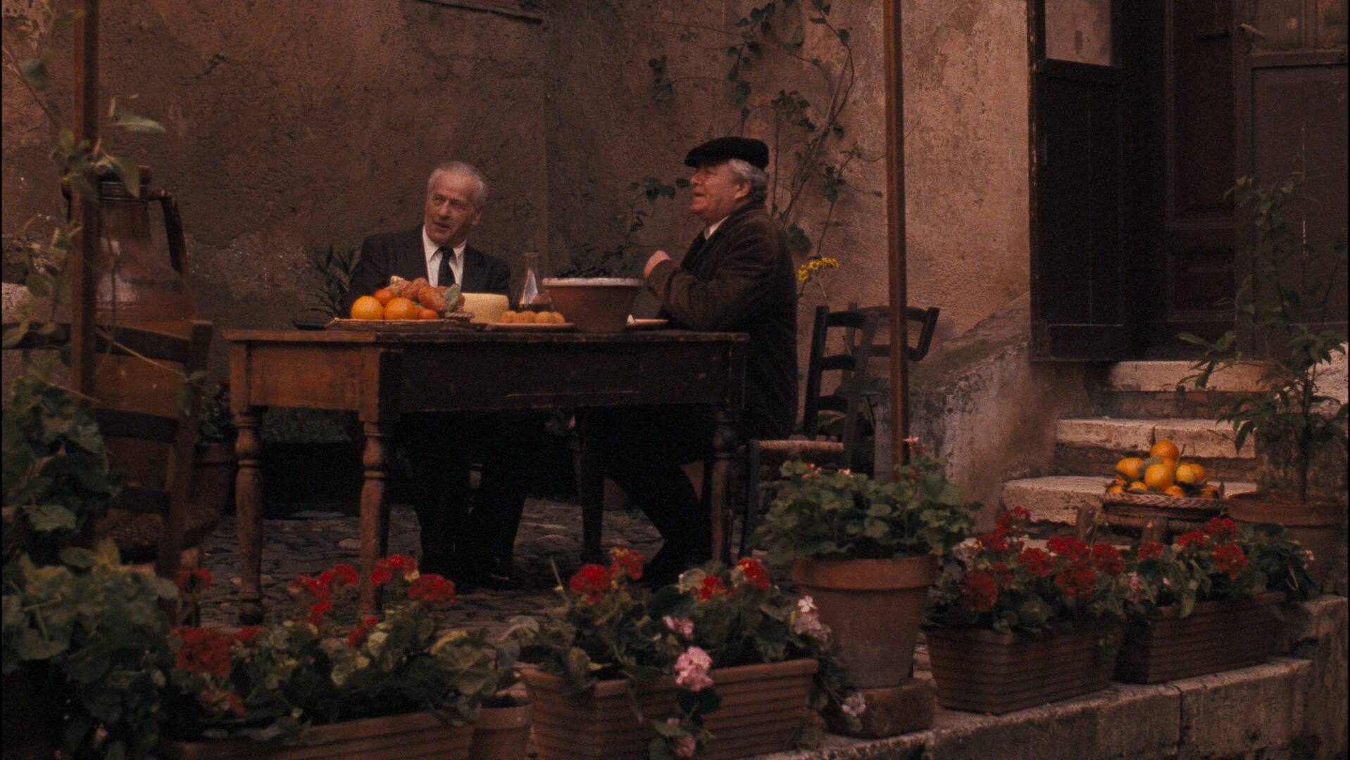
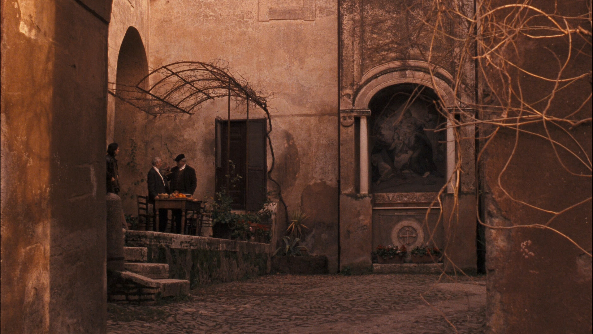
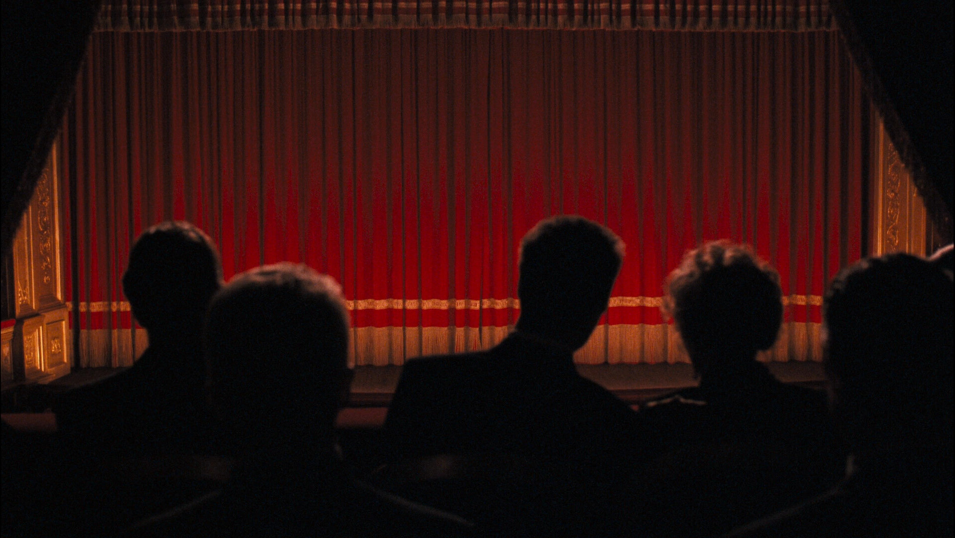
OK, that’s a nice shot…
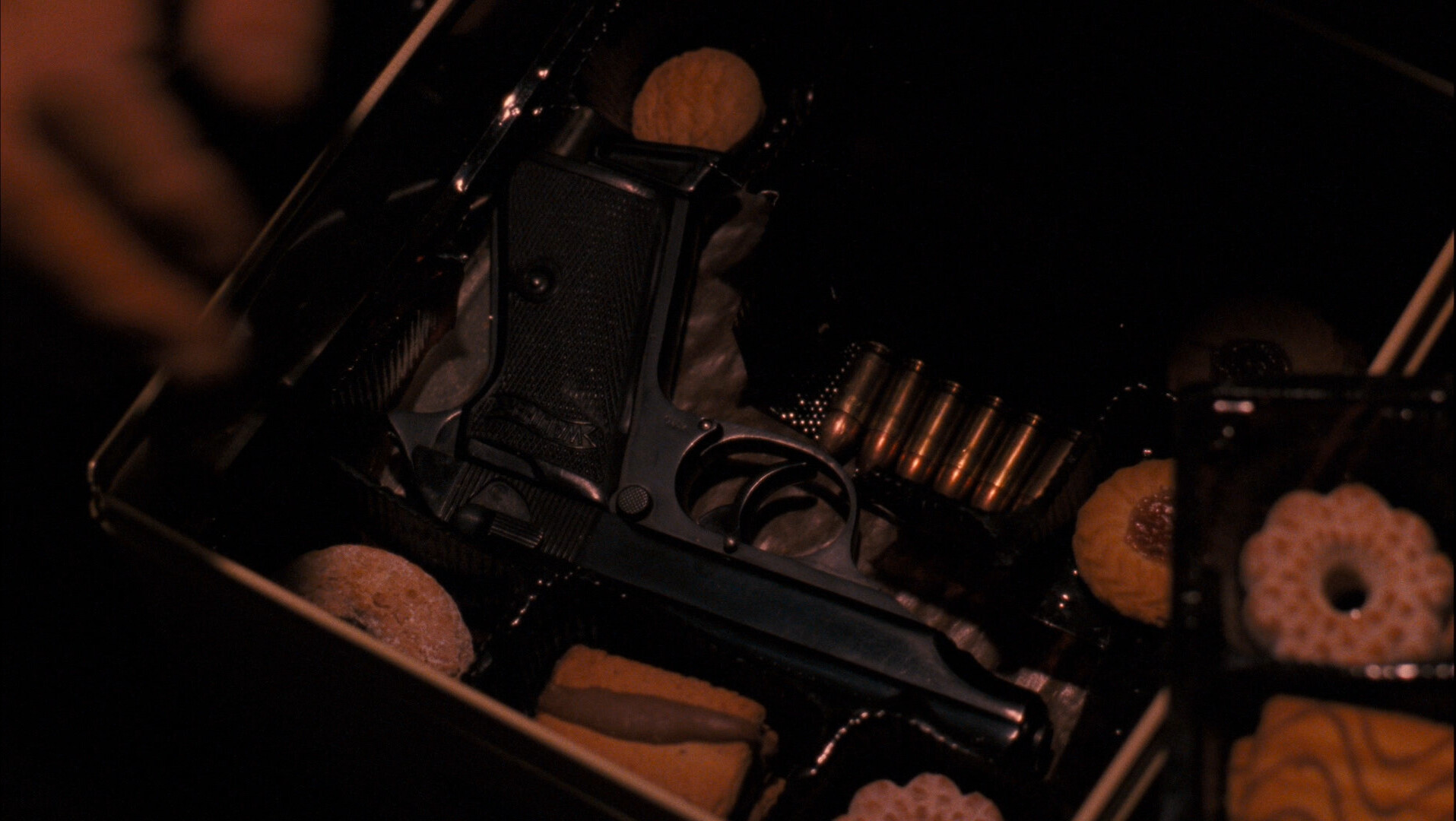
And that’s horrible!
It’s like there’s accidentally shots that are interesting?
Wat.
This is a horrible movie!
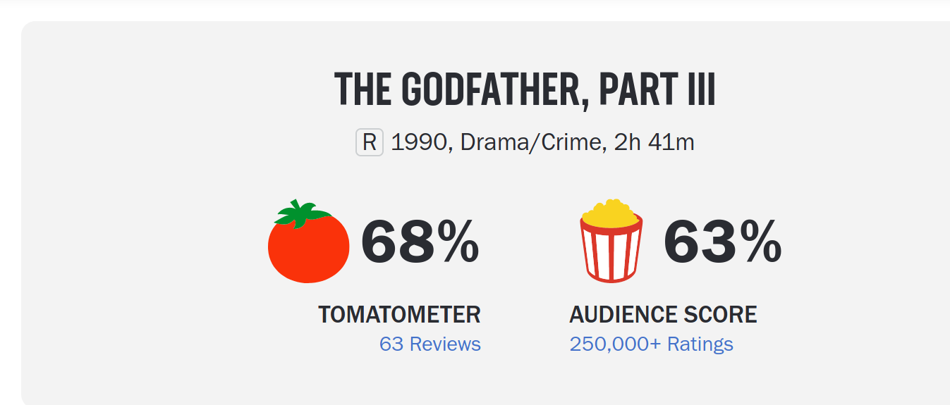
What’s wrong with these 68% of people!
Yeah… but that’s the redeeming quality?
That’s a reasonable interpretation. I thought that Coppola was trying to make as much of an ass of Michael Corleone is possible (to hammer in the point that he’s a total moron and a buffoon), but it’s a reasonable interpretation…
Hm… er… imdb says that this is an:
Aspect Ratio: 1.85 : 1
But… this bluray is 16:9, i.e. 1.77:1… so this is a fucking tilt’n’scan edition? Or… er… math is hard… Is it a fucking pan’n’scan edition?
I’m too drunk to do maths.
This is just unimaginably bad.
How did this happen? Was this financed by Golan/Globus who thought they’d have a winner on their hands or something? It’s totally like one of their movies, only more portentous.
Did Coppola have religious damage? Is that why he made this movie? I mean, the real reason he made this movie was probably because he got a bunch of money to do it, but… why not do something fun instead of this dreary march towards nothing?
OK, I’m going with my first instinct: Coppola did this to show that mobsters suck and aren’t any fun.
The Godfather Part III. Francis Ford Coppola. 1990. ⚁




Leave a Reply